Ideas for improving your catalog ad designs
Learn different ways to improve the designs you use in your Catalog AdsTable of Contents
Show different informationTalk about different informationShow why to buy the productTry different messagingTry different design formatsChanging formatChanging product imagesChanging colors and backgroundsChanging (almost) everythingAdd tailored Design RulesOn saleCategoriesAge groups, gender, or ideal userPrice types like deals, outlet, member priceNew productsPopular productsCustom_labelsMake product info visual with Product AssetsShow brand logosShow ratings and reviewsShow Custom labelsHow to implement a new designMake the design in ConfectImplement the design via Design RulesImplement the design via VariantsHow to test new designsThe toughest part about designing?
Figuring out how the design should look like.
When you know what you want, it's typically easy to make your designs go live with Confect.
.jpg)
That's why we have collected a lot of inspiration of different design options here - so you can find inspiration on how to improve your current Catalog Ads.
Overall, there are 4 different things you can try out:
Let's dive into it!
Show different information
Talk about different information
Displaying varied information in your Catalog Ads can engage customers by focusing on the details they care about most. Different audiences respond to different kinds of information.
Eco-conscious buyers might be interested in the environmental impact of a product, while wine enthusiasts may look for specific tasting notes or ratings.
.jpg)
Your job as a marketer is to show the consumers the information that is most likely to make them buy the product.
For some products this might be specific features or attributes like grape and year for a wine, or like Closely put into their Catalog Ads the carbon footprint of each product:
.jpg)
Exploring various information types can also help you discover what works best for different segments of your audience.
Remember that adding more and more information is not the goal; The goal is to show the exact information consumers need to buy the product.
.jpg)
For some wine buyers the price and ratings is the most important information.
For other wine buyers the grape, area, and vintage (year) is the most important information.
And for fashion buyers? Multiple images might be the most important information.
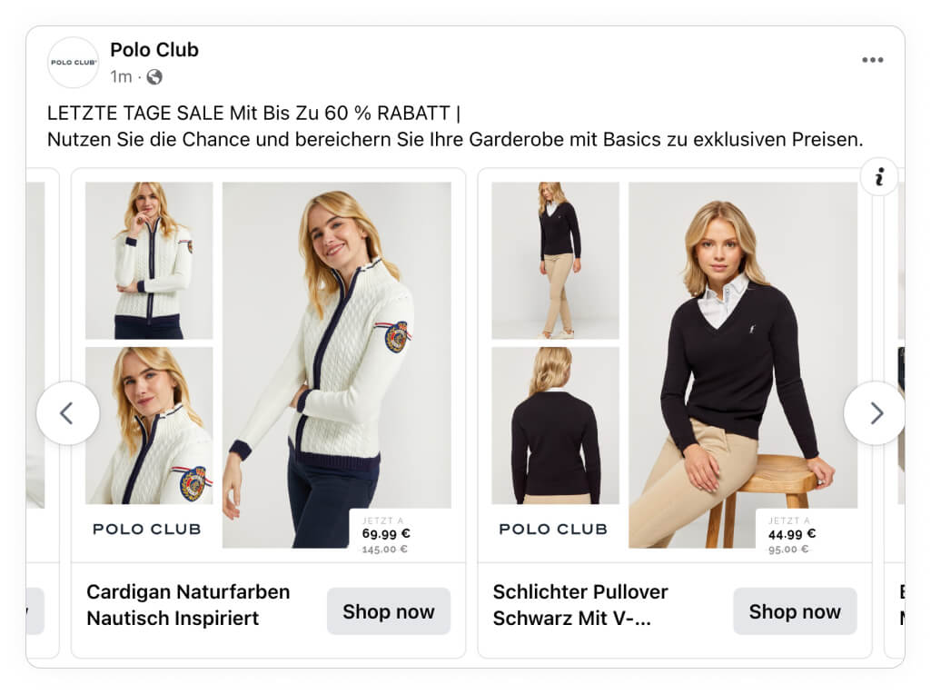
By testing multiple versions showing different information, you can refine your approach to maximize engagement and improve ad performance. This ensures that each Catalog Ad speaks to the right audience with the most compelling information.
Show why to buy the product
This is probably the insight that all us marketers know by heart - but often forget in our daily work.
Your most important job as a marketer is to show people why they should buy your products - And why they should buy them from you.
This might include benefits like durability, specific features, or even how it’s made.
Elgiganten often show 3 bullets in their Catalog Ads, showing unique features for each product:
.jpg)
Interestingly enough, they both show why to buy THIS product (the different features), but also why to buy this product FROM THEM (their price match badge in the bottom left corner).
If you have the information available, it can also be very worth testing out, showing the benefits and outcomes of your products - like Allbirds does in their Catalog Ad below, noticing the perfect use case for each product:
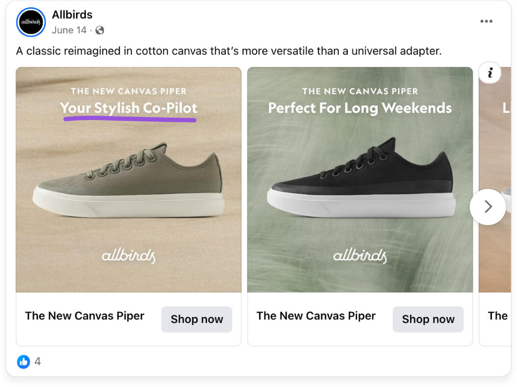
It can be incredibly effective to show consumers why they should buy your products - and why they should buy them from you.
A well-informed customer is a confident customer, and Catalog Ads that clearly communicate product benefits can create a sense of value that encourages action.
Try different messaging
Experimenting with various messages can help you find the information that resonates best with your audience.
Some audiences respond to straightforward messaging that highlights essential features and benefits, while others prefer a more creative approach that tells a story or evokes emotions.
PrettyLittleThing are often testing different messaging styles in their Catalog Ads, highlighting different aspects:
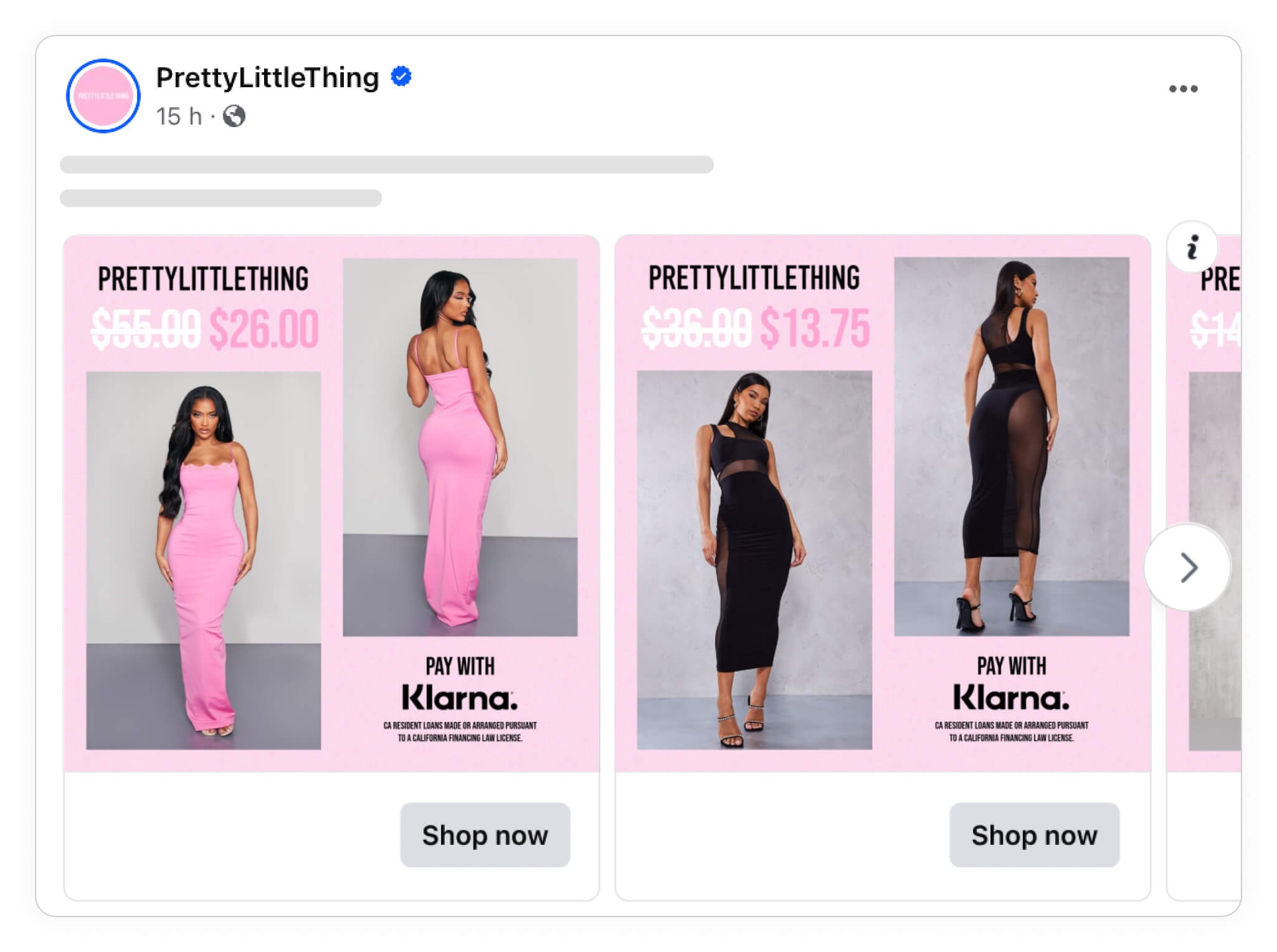
From showing the price, original price, and their "buy now pay later" option in their first design, they convey very transactional information to the consumer (this product is discounted, and you can buy now but pay later).
In other Catalog Ads they use the same overall format, but instead focus on their Free shipping, the saving in %, and the price - giving a very different experience for consumers:
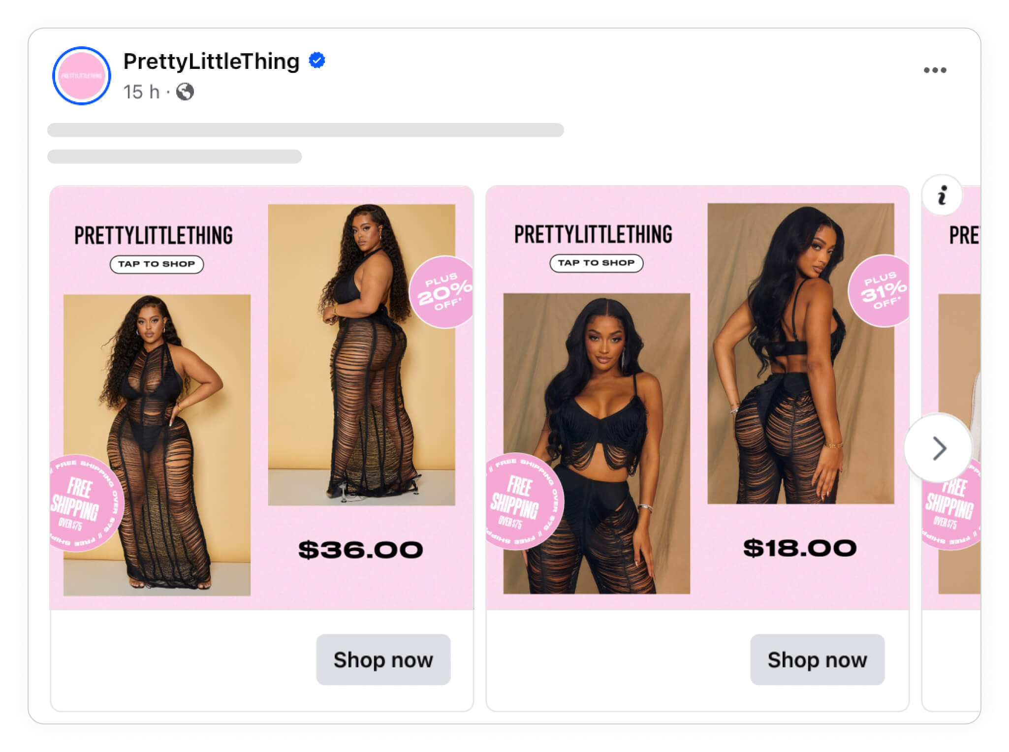
By trying out diverse messages, you can adapt your approach to different segments within your audience.
This can both be tried with A/B testing, but is especially effective in Advantage+ campaigns.
Try different design formats
Changing format
If you are not sure what to test with new designs, but want to find ways to improve design, you can try changing the overall format of your design template.
In other words, Duplicate your current design and move the different elements around.
JD Sports are testing out different design templates in their Catalog Ads - in some cases, they show a design giving the product image a lot of attention:
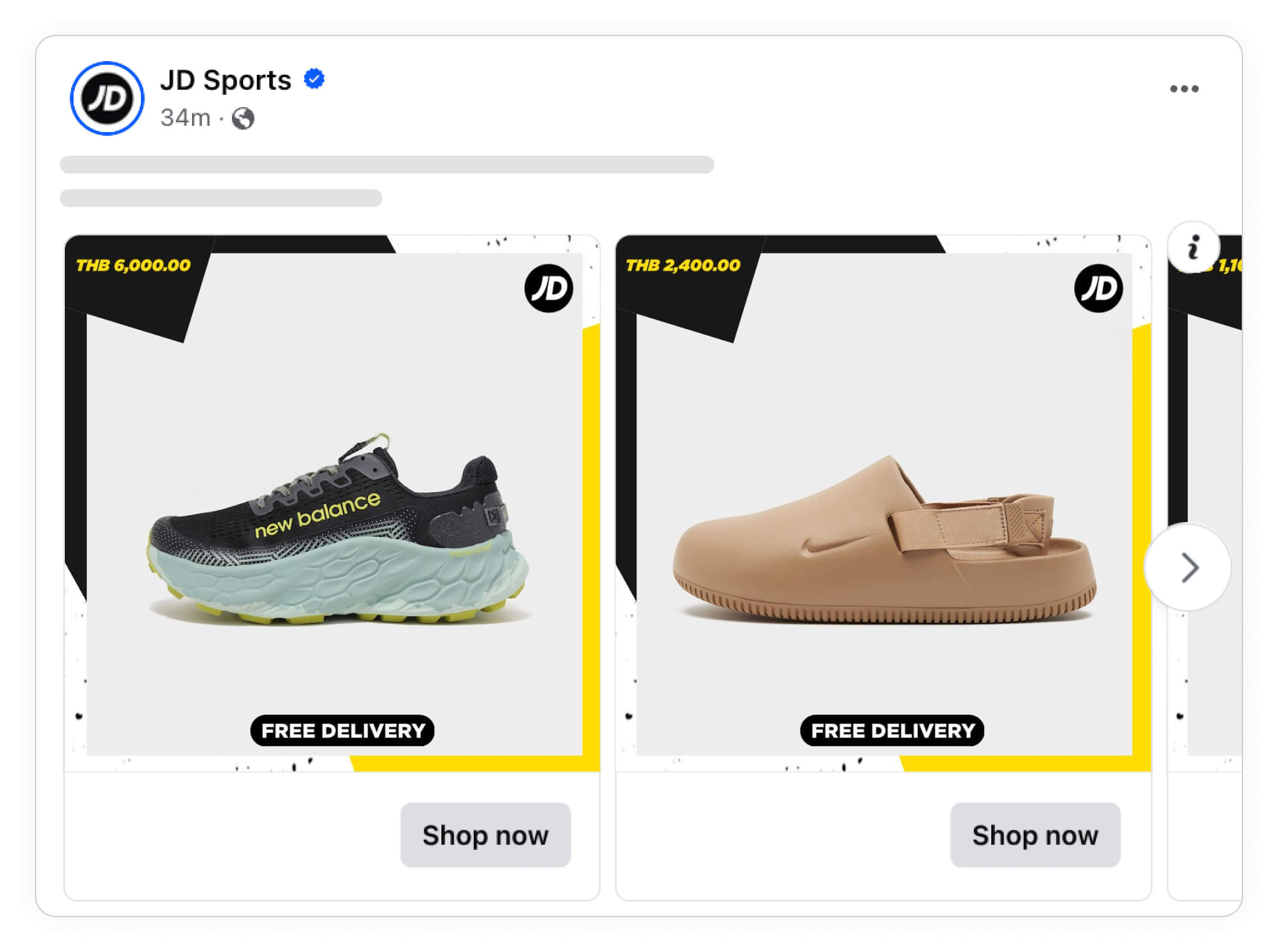
Whereas in other Catalog Ads, they show the exact same information (their logo, the price, and a free shipping badge) but placed differently and with tiny changes to the background:
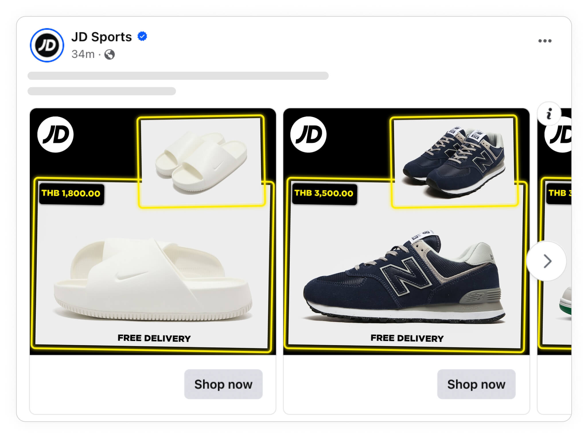
You might not have a hypothesis of which design you think will end up performing the best, or why certain changes will perform better or not. But different designs, with different visual hierachies, will definetely perform differently.
Changing product images
The images you choose for your Catalog Ads are crucial, as they’re the first thing your audience will notice.
Experimenting with different product images can reveal which visuals resonate most with your audience.
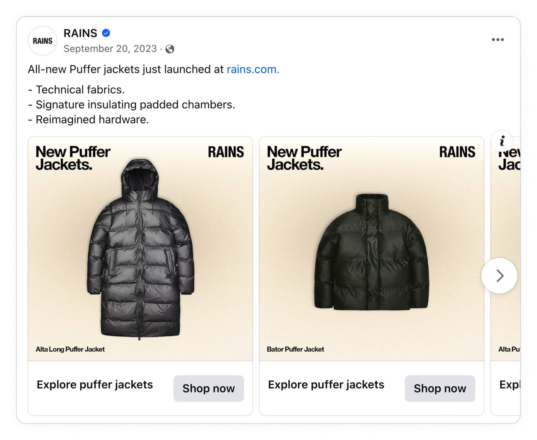
The fashion brand RAINS are good at testing this in their Catalog Ads, showing packshots with text in some of their ads:
And in other Catalog Ads they are showing the products worn by models instead, highlighting the lifestyle and feeling of their products over rational information:
.jpg)
And last but not least, they even mix different image types in other Catalog Ads - showing both the packshot and lifestyle image together - giving all the visual information a user could need:
.jpg)
Which product images you use for your catalog ads will convey very different feelings about your ads. Make sure to use images that reflect your brand’s personality or evoke that specific feeling.
Showing products from different angles or in various settings can help you discover what catches your audience's eye.
You can see more on showing additional_images and different images in your Catalog Ads right here.
Changing colors and backgrounds
Experimenting with colors and backgrounds in your Catalog Ads can make your products pop in wildly different ways - and influence your performance in big ways as well.
Regularly updating colors and backgrounds can also help prevent your ads from becoming stale and thereby combat ad fatigue. By experimenting with different visual styles, you keep your ads visually engaging, encouraging viewers to take a closer look.
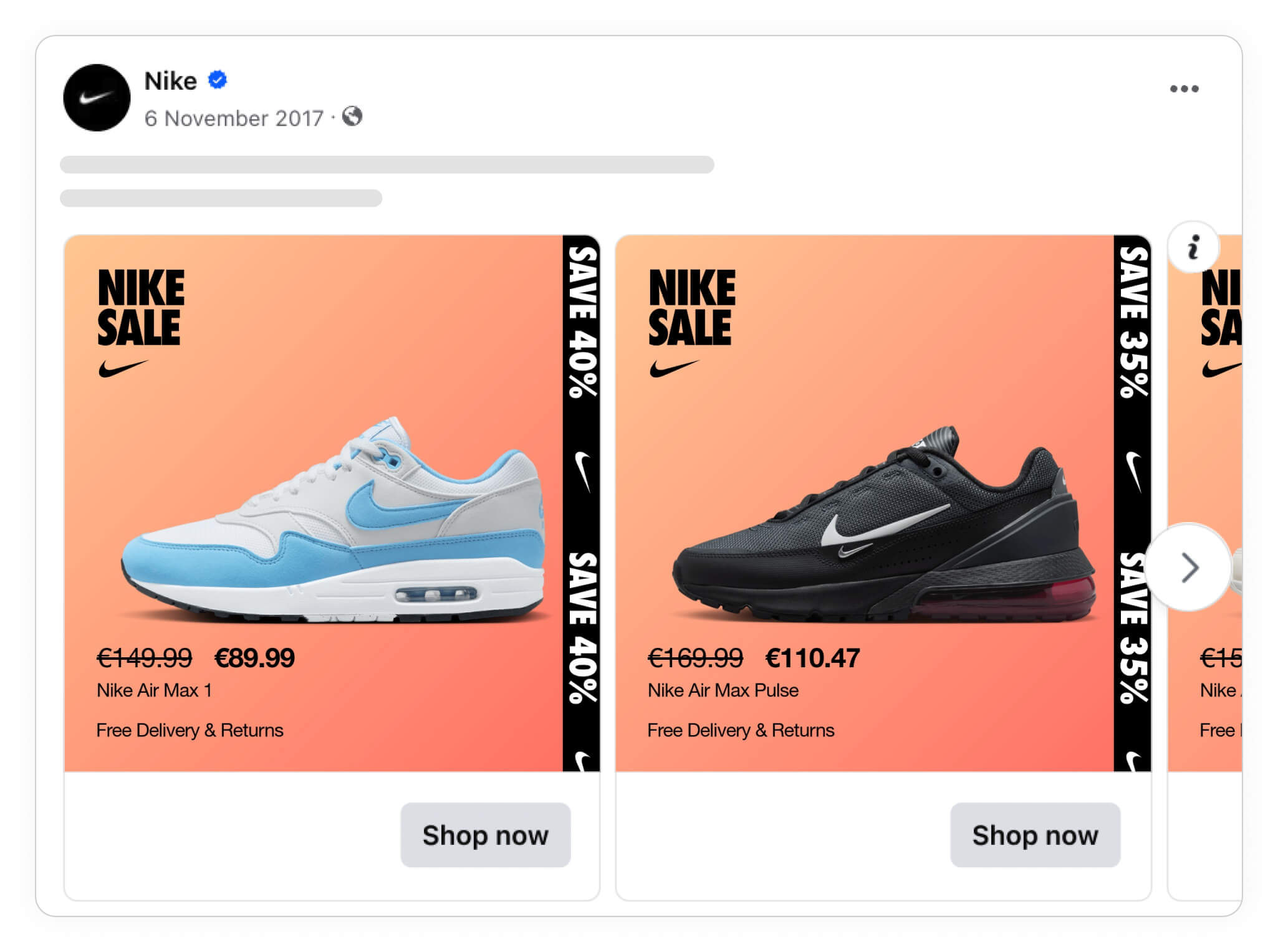
Nike often tests out different backgrounds and colors in their Catalog Ads - even the smaller things, like whether to use an orange gradient as a background or a blue background.
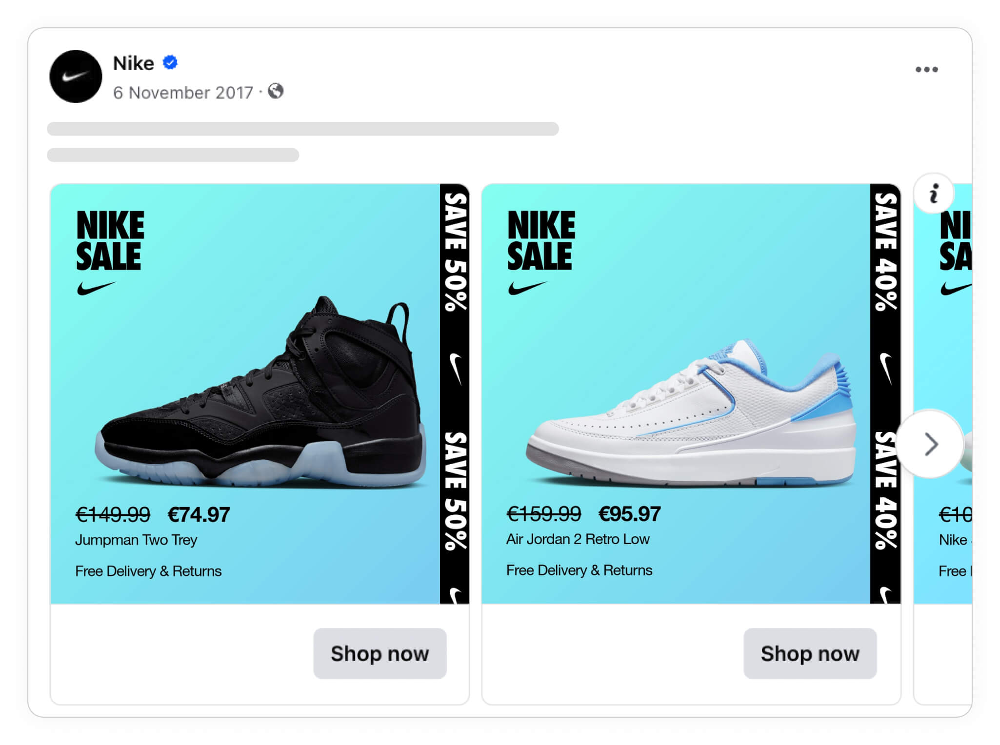
As long as you stay on brand, testing out the backgrounds or the colors you use can be a surprisingly effective way to improve your performance.
And the best thing? As you probably already have these images available, it only takes a few minutes to change the background.
Changing (almost) everything
The bigger changes you make to your design, the bigger performance changes you will typically see.
So if you want to find very good - or very bad - designs fast, it's a good idea to test wildly different designs against each other, changing many things at the same time.
SOFACOMPANY, a furniture brand, often tests very different designs. Sometimes they run some fairly subtle Catalog Ads, that are easy on the eyes, easy to understand, and make the products pop:
.jpg)
While they at other times try out very attention-grabbing designs, that for sure will make users notice the Catalog Ads in their feed:
.jpg)
It can be difficult to know beforehand which of these Catalog Ads will perform the best beforehand, as they are good in different ways.
But most people agree that the results will for sure be very different - making it the perfect test.
Add tailored Design Rules
Design Rules let you customize Catalog Ads for specific products, categories, price levels, or even time periods.
With Design Rules, you can automatically adjust the look of your Catalog Ad based on rules you set up.
With Design Rules you gain control over how each product is presented in your ads. This level of customization makes your ads feel dynamic and relevant, ensuring that every ad speaks directly to your audience’s needs and interests.
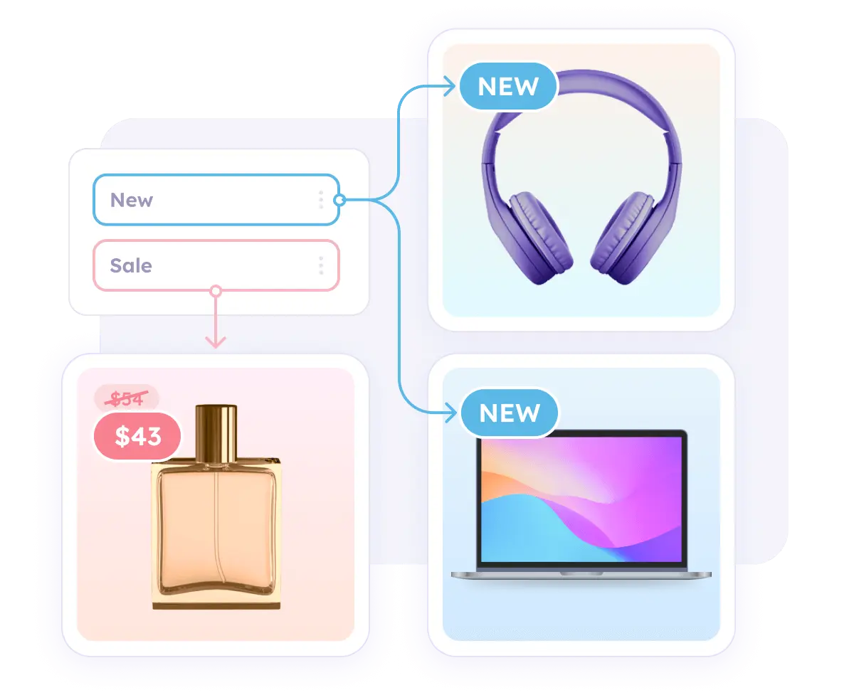
This can be rules like:
If price is on sale show "sale design"
If category = football show "football design"
If custom_label_2 = popular show "bestseller design"
You can learn more about using Design Rules in your Catalog Ads right here.
On sale
Tailoring your Catalog Ads with sale-specific designs can boost relevance and grab attention from potential customers very quickly.
Adding elements like a “Sale” badge or displaying the discount percentage directly on the product image quickly informs viewers that they’re getting a special offer. This approach can make your ads more appealing and encourage shoppers to take immediate action - before it's too late.
.jpg)
It is a no-brainer if you have products that are currently discounted - showing it performs better, and the product is on sale no matter what.
You can see more on showing savings and discounts in your Catalog Ads right here.
Categories
Using category-specific designs for your Catalog Ads can make your ads feel more relevant to your audience.
Each product category has unique qualities and associations, so tailoring designs to match these can help highlight the right aspects.
Logitech did this in a great way by having a gaming-design for their gaming products:
 (1).jpg)
But Logitech don't stop there.
They also show a special office-design for their work products, changing the background to a wooden desk:
1 (1).jpg)
And for the kids products they make the design more playful, with vibrant colors and engaging icons:
 (1).jpg)
These tailored designs also allow you to present products in a way that’s consistent with customer expectations. When your ads feel aligned with the product category, they become more appealing and intuitive for the viewer.
Age groups, gender, or ideal user
Designing Catalog Ads that speak to specific age groups or demographics allows you to reach the audience most likely to connect with your products.
By tailoring your ad visuals to align with the preferences of different age groups or genders, you create a more relevant shopping experience.
Adidas does it for their products targeted kids, showing a "KIDS" label:
.jpg)
Because of this the consumer can quickly evaluate whether this product is for them or not - not having to click on the ad and get disappointed on the landing page.
It will both train the algorithm better (who is most interested in which products) and align expectations with consumers way better.
Price types like deals, outlet, member price
Creating Catalog Ads with design elements specific to price types, like deals or member prices, helps build transparency and makes it easy for customers to understand what’s special about each offer.
For example, a “Member Price” badge on the ad communicates exclusivity, while a “Deal” tag emphasizes savings.
.jpg)
Zalando are great at showing different price types, like showing a "deal" tag in their Catalog Ad above.
IKEA are also using the same tactic for their "IKEA Family offers":
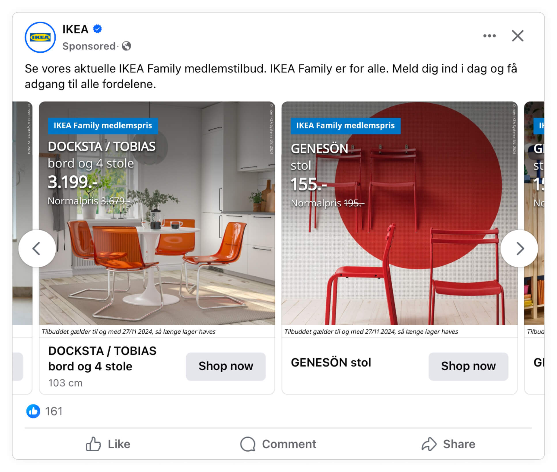
If your strategy resolves around different types of discounts - like having both an outlet and membership prices - it can very well be worthwhile to incoorporate it into your Catalog Ads.
You can see more on showing prices in your Catlaog Ads right here.
New products
Showcasing new products in your Catalog Ads is a powerful way to attract customers looking for the latest trends.
By incorporating “New” labels or fresh design elements, you signal to viewers that these products are worth checking out. This approach is especially effective for seasonal or trendy items, as it taps into shoppers’ desire for newness and novelty.
IKEA are good at this, showing their newest products in their Catalog Ads:
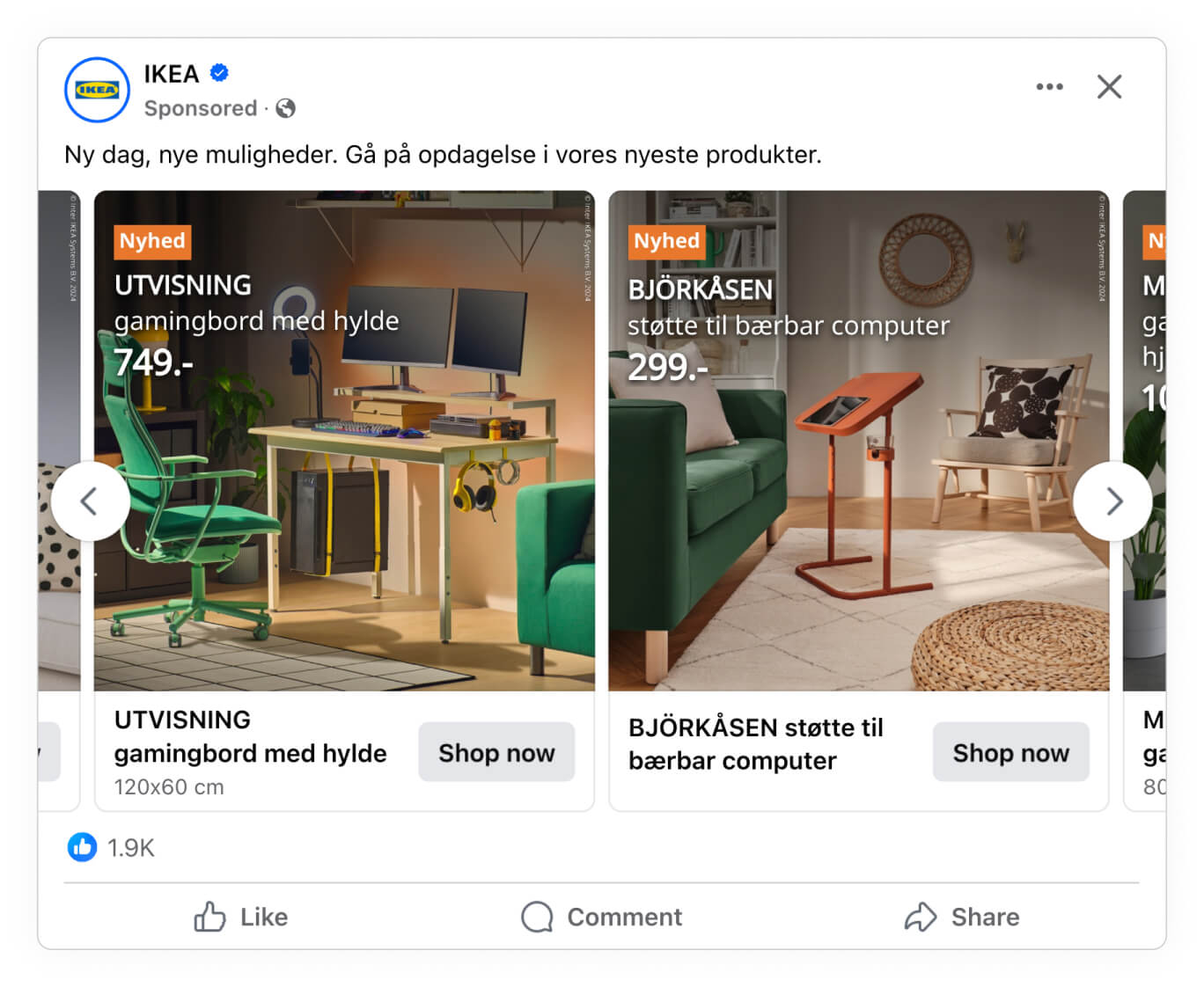
Positioning new products as the centerpiece of your Catalog Ads not only drives curiosity but also encourages frequent engagement.
When shoppers see “New Arrival” labels, they’re often intrigued to learn more, and this additional interest can increase engagement with your Catalog Ads
You can see more on showing news in your Catalog Ads right here.
Popular products
Highlighting popular products within your Catalog Ads can create a sense of social proof and urgency.
When customers see that certain items are marked as “Popular” or “Bestseller,” they’re more inclined to explore those products further, trusting that other shoppers have found them valuable.
.jpg)
This not only builds trust but can also accelerate purchase decisions, particularly for buyers who are weighing multiple options.
Your Catalog Ads become more than just a list of items—they tell a story of what’s currently trending, encouraging potential buyers to explore and discover what’s resonating with other customers.
Custom_labels
Using custom labels in your Catalog Ads gives you a versatile way to highlight specific product attributes or unique selling points.
Custom labels can be any data you have, like “Eco-Friendly” or “Limited Edition”, and make it easy to draw attention to special characteristics and features that set certain products apart
Elgiganten are great at this, showing the energy efficiency of different products:
.jpg)
RAINS are also utilizing it in some of their Catalog Ads, showing the different relevant features their products have: Whether the product is waterproof or not, functional or not, and alike:
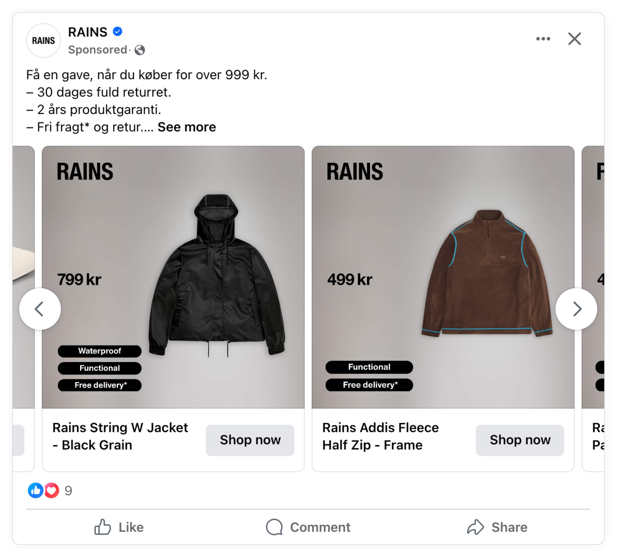
This added layer of information helps you tailor your ads to different customer needs, making your Catalog Ads feel more informative and relevant.
You can see more on showing custom_labels in your Catalog Ads right here.
Make product info visual with Product Assets
Product Assets help transform your Catalog Ads by adding visually engaging elements like logos, ratings, and custom labels - instead of just showing it as text.
These details create an informative and appealing presentation, making it easier for customers to understand what makes each product special.
By adding Product Assets, you turn a simple product display into an enriched experience that captures attention.
You can see more on showing Product Assets in your Catalog Ads right here.
Show brand logos
Including brand logos in your Catalog Ads helps create a sense of recognition and trust.
For well-known brands, a logo can act as an instant endorsement, drawing customers who are familiar and loyal to the brand to take a closer look.
Intersport show brand logos in a great way in their Catalog Ads, making it easy for Nike-fanatics to find the most appealing product:
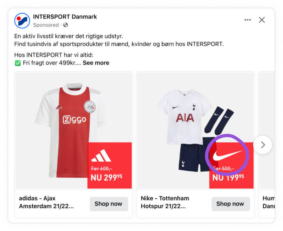
Human beings see and understand much faster than they read, and therefore, it can be smart to show the brand logos in a visually appealing way instead of with text.
You can see more on showing brand names and logos in your Catalog Ads right here.
Show ratings and reviews
Displaying ratings and reviews in your Catalog Ads leverages social proof to increase customer confidence.
When customers see positive feedback from others, they’re more likely to trust the product and feel comfortable making a purchase.
Amazon is one of the companies that are very good at utilizing Social Proof in their Catalog Ads:
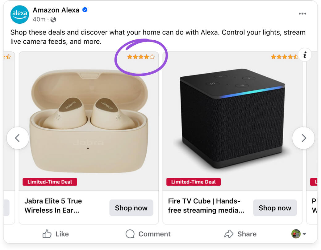
Showing ratings directly in the ad also helps answer common customer questions about quality and reliability, saving them time and simplifying their decision-making process.
When making customer feedback visible, you’re not only promoting your product but also showing that your brand values openness and customer satisfaction.
This approach adds a personal touch to your Catalog Ads, making them feel more like transparent recommendations than advertisements.
You can see more on showing ratings and reviews in your Catalog Ads right here.
Show Custom labels
Using custom labels as part of your Product Assets can help emphasize important product features and enhance the overall visual appeal of your Catalog Ads.
Canada Goose have done this in a great way, showing the ideal temperature ranges for each of their products - a very important information for their products:
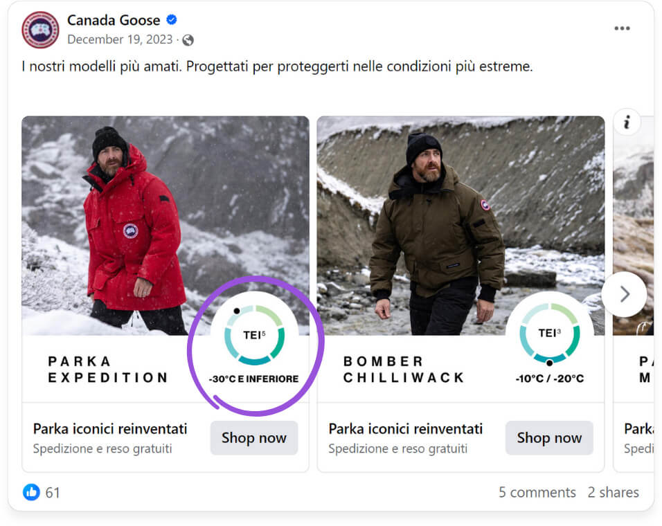
Custom labels also add structure to your ads by categorizing products according to their attributes. This makes it easier for customers to identify products that match their preferences, simplifying their shopping journey.
Dell are also good at utilizing custom labels like this, showing which processor that is inside each computer:
.jpg)
This makes it easy for consumers to find the product that fits them the best - whether it's a professional "evo i7", or a "core i5" meant for basic usage.
You can see more on showing Custom_labels in your Catlaog Ads right here.
How to implement a new design
Implementing a new design in your ads is very easy to do, as soon as you have figured out how you want the design to look.
Let's dive into it:
Make the design in Confect
First step in getting a new design live in your ads is to make the design in Confect.
The easiest way to make a new design is to start from one of your other designs. You can do this by duplicating the design template you want to start from, and then make your desired changes.
Once you have your design ready, you can go into your Meta catalog in Confect, and click edit.
You can see how to add product information as text here.
You can see how to use Product Assets right here.
You can see how to use the Confect design editor right here.
And you can see all our articles on designing in Confect right here.
Implement the design via Design Rules
If you want to implement it across all your ads, you can do so with Design Rules.
Design rules are conditional rules for which design template to use for different products or during different time periods.
This is ideal for designs made specifically for products on sale, for changing design based on category, and alike.
You can see how to implement designs via Design Rules right here.
Implement the design via Variants
If you want to test it out in a new ad, you can do so by making a new variant.
Variants give you the option to make your designs ad-specific; Making it possible to only show this design variant in this specific ad.
To make a new variant, you should go to your Catalog and create a new "variant".
Give your variant a relevant name, and pick your new design as the main design.
You can still make design rules if you want, for instance, changing the design template if the products are on sale, or if products are from a specific category, or any other information you have about your products.
Pick the new variant in your ad
When you have saved your new variant in Confect, it's time to go to your ad in Facebook Ads Manager.
In the Facebook ad, we can now select the new variant in the Confect dropdown.
Make sure that you have the Confect Chrome Extension, as this is required to change variants in your Facebook Ads Manager.
When you have switched variant, you can now see your new design variant applied in the ads preview - which means we are ready to set the ad live!
You can see how to implement designs via Variants right here.
How to test new designs
We heavily recommend you to A/B test your new design against your currently running design.
Some designs perform better, some designs perform worse - so it is essential to know the performance difference before replacing your old design.
To A/B test designs against each other, each should be created as a variant, and you can then set up an A/B test between different ads using these variants in Meta.
You can see how to A/B test design variants right here.