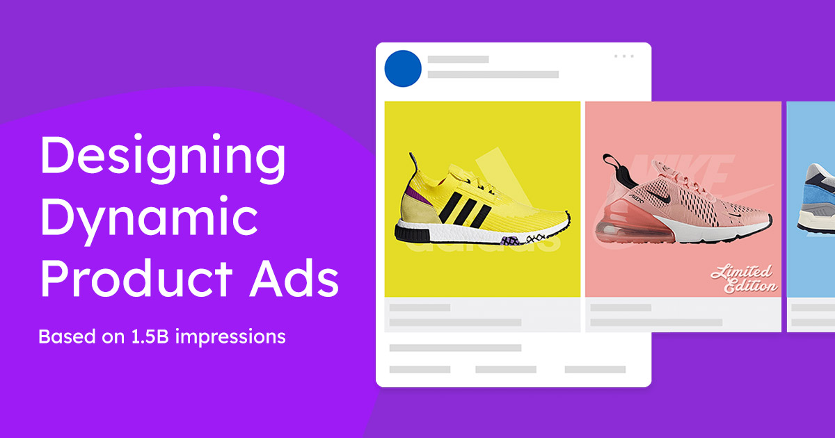
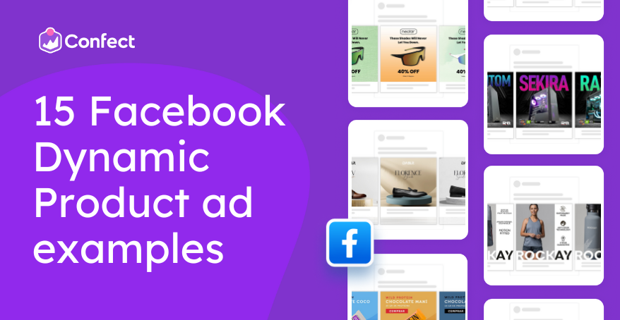
Design inspiration for catalog ads
Design examples & different ways to use Catalog Ads.Table of Contents
Design examples & inspirationCatalog Ads tips & tricksCatalog Ads for your industryDeep dive into design choicesUse cases for Catalog AdsCampaign adsCategory specific adsSale adsAudience specific adsPrice related adsInformation in adsOther examplesOkay, you don't want to read a long text. You just want to see a lot of great ways of using Catalog Ads. So let's get to it.
Design examples & inspiration
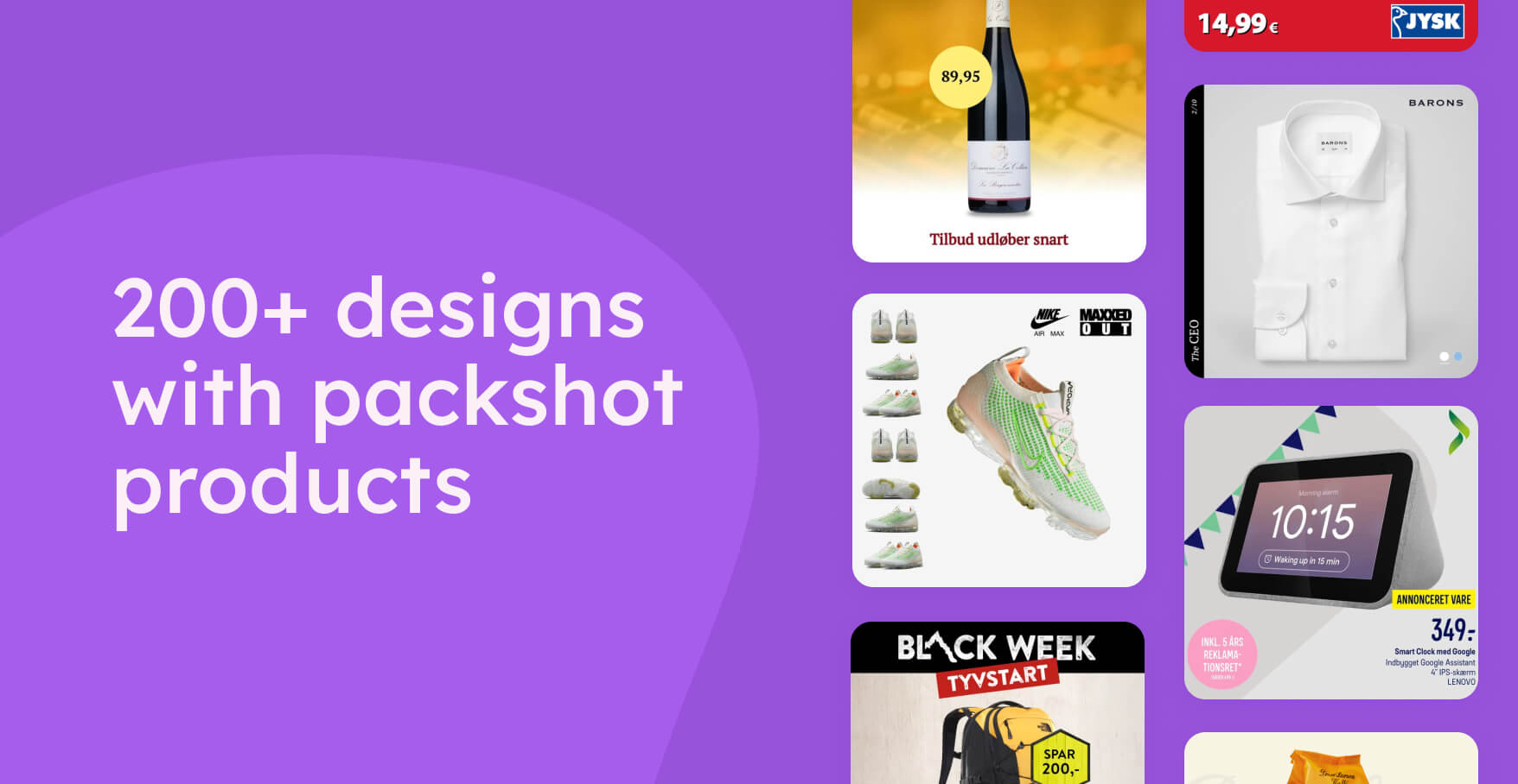
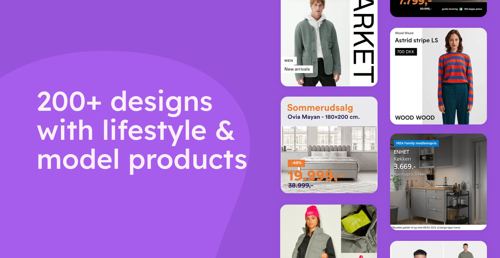
Designing Catalog Ads can sometimes feel different than other ads. That's why we have collected more than 400 different designs, that can inspire you on how to design for Catalog Ads:
Catalog Ads tips & tricks
Learn how to use Catalog Ads the best in different scenarios.
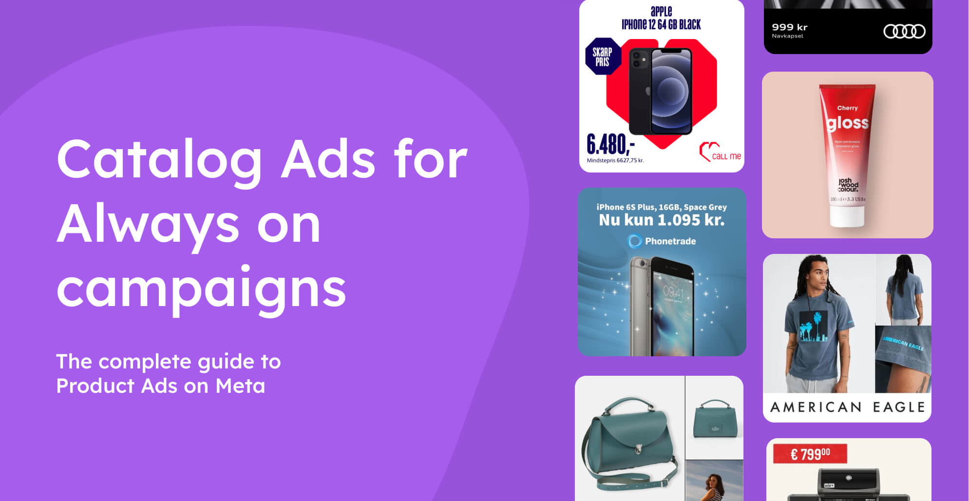
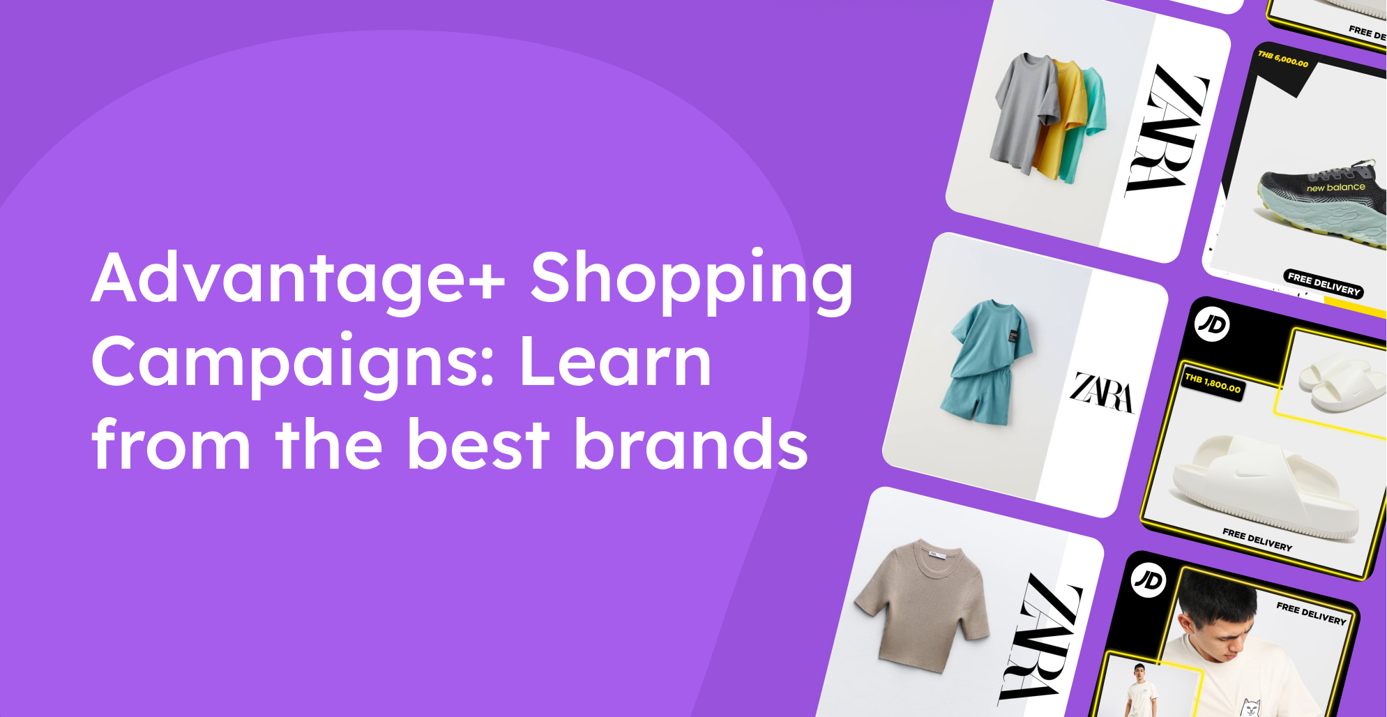
How can you optimize your Catalog Ads in your Always On ads? Or how to optimize it for Advantage+? Let's figure out!
Catalog Ads for your industry
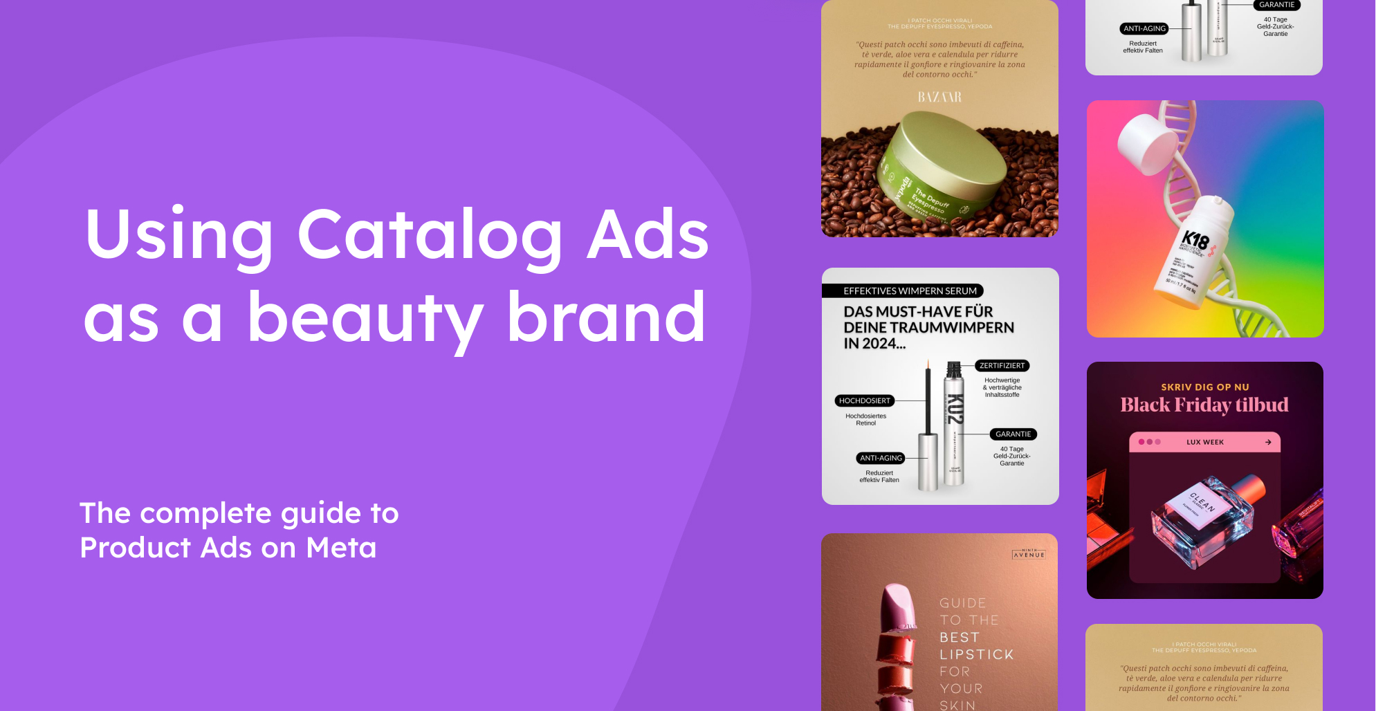
We have collected different tactics that some of the best brands in each industry are using for their Catalog Ads.
Great inspiration if you want ideas on how to utilize Catalog Ads even better.
Deep dive into design choices
What design choices can you consider showing in your Catalog Ads?
Here are some guides on different design choices - how well they perform on average - and examples of how to design them better.
Use cases for Catalog Ads
There are a loooot of use cases for Catalog Ads. We've collected some of the better ones here.
Remember that you can change the design based on the ad.
What that means is, that you can create different ads with different purposes - a smart tactic for Advantage+ campaigns, now Meta will show the best ad for each user, and distribute spend based on this.
Campaign ads
Anniversaries & events
Mother's day, Valentine's day, Pancake day, Birthdays, and the list goes on and on. Ecommerce companies typically have a lot of anniversaries and events that they celebrate as a campaign.
.jpg)
Showing designs made specifically for these anniversaries and events will both help you synchronize your top funnel and bottom funnel, but also utilize the urgency of the event: Typically, such events only last a day or a week.
Seasons
If you want to combat ad fatigue, making your customers less bored of your Catalog Ads having seasonal designs might be a good idea.
.jpg)
If used correctly, seasonal designs can also help customers understand why they should buy your products. Yes, it's a ring, but it's more importantly, a perfect Christmas gift.
And the good thing about seasons is, that they come and go every year - making it easy for you to reuse your spring designs next year too.
Product specific campaigns
If you sometimes have campaigns or sales on specific products - making a specific design for this can work wonders, if there's more than 3 products in your campaign.
 (1).jpg)
No matter if it's 50% off on all Argentinian products because of the world cup win, a campaign showing the best products for the weekend, or "Dyson days" - contextualizing the design to this campaign can be an extremely effective tactic.
Category specific ads
Category specific
Designing your Catalog Ads is all about selling each product in a better way. And typically, the category is the best way to sell the product, because of how it solves a specific need.
.jpg)
Showing a gaming design for your gaming products, an football design for all your football products, a sleepy design for all your beds, or a healthy design for your health products, can help you repeat the reasons people have for buying products in that specific category.
Brand specific
Do your customers buy specific brands that they really love? Or do each of your brands have a distinct style? Then making brand-specific designs that are designed with the brand's style guide in mind can help you sell more of that brand. People will recognize the brand way faster than with generic designs - an important trait with today's short attention spans.
 (1).jpg)
Making an Apple-specific design for your Apple products, or a Nike-specific design for your Nike products, might help you piggyback on the trust the consumer has in these brands.
It can be as simple as using a brand-specific background, such as in this example, where the advertiser uses a LEGO plate background for all LEGOwear products.
On top of that, you can even use it in procurement negotiations with your supplier - since you're advertising for them.
Especially if the brand paid you to do a promotion, this is a great choice. Most possible revenue from the ads and most possible recognition from the brand.
Catalogs & retail leaflets
If your company have catalogs or leaflets with great offers, showing them in your social media is probably an effective way of getting the word out.
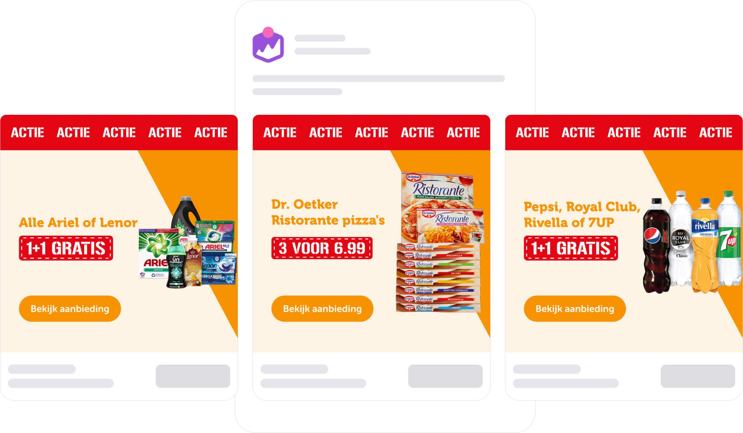
These catalog ads are typically very effective because of two things: First of all, the offers will expire, utilizing urgency to the fullest, and second of all, it's the best offer your shop could produce since this product made it to the catalog.
New products
If your customers are passionate about your products, showing them the newest products can be an effective tactic.
 (1).jpg)
Passionate users of your products will be able to scroll through and explore all the new possibilities they might not have seen yet.
Promote a collection
If some of your products are linked to a specific collection, drop, or other special group of products, you can design an ad specifically for them.
It can work very well if the collection have a distinct style - that you want to express in your ads.
.jpg)
It's especially smart for brand-aware shops, that want to make sure that every experience with the customer is enjoyable.
Showing bestsellers
Studies have shown that people can be considered herd animals because of our tendency to go with the group. And if the group bought these bestsellers, it might very well be worth buying them.
.jpg)
Often your shop might offer a lot of products solving the need of the consumer, leading to an information overload for the consumer. Getting an ad for the bestsellers of your interested category helps you solve this - then you just buy the same one other customers bought.
Pre order
Are people waiting and waiting to buy your new products? Then pre-order designs can be effective for your products that are not yet live.
 (1).jpg)
Products available for pre-order can be bad to include in your other ads as customers, by nature, can't get fast shipping on products that can't be ordered yet. That's why a specific pre-order track might benefit your company, if you are selling products for pre-order.
Sale ads
Special sales
Sales are effective, yes. But: Giving a reason for why you're having the sale is often even more effective.
.jpg)
This can be by naming your sale (archive sale or easter sale), telling why you're having a sale (making room for new styles), and alike.
By having a design specifically for each sale, instead of a general sale design, you increase the urgency and scarcity a lot: This sale is not a normal sale, and it's expiring at some point.
Weekly or daily deals
Weekly and daily deals are extremely powerful - but tough to advertise manually because of the recurring tasks of uploading new content and combating the learning phase. That's why Catalog ads are great for weekly and daily deals - since they update automatically, every single hour.
 (1).jpg)
Emphasise in your design how this deal only is available this day or this week - this will for sure make people stop and consider your deal.
Outlets
On average, we see that outlets have a 34% lower Cost Per Purchase than other types of sales (data is based upon 3.1B impressions and 36.3k pieces of content). That's a pretty good reason to try out making an outlet-specific design.
 (1).jpg)
Having a specific outlet design can also help brand-aware shops distinguish themselves a bit away from being a brand that "always have sales".
Last chance
Your products will not be on sale forever - and mentioning to the customer that this probably is their last chance to get this product for this great price can be an effective tactic.
.jpg)
Try using words like "last chance", "2 days left", "ends 31st may", "sale ending soon", or other powerful sentences to create more urgency.
Audience specific ads
Objection handling for retargeting audiences
Making a design specifically to retargeting audiences can be a smart choice. They've already shown interest in the products, and now just need the last reasons to buy.
.jpg)
Handling all their objections in a design - and answering their buying questions - can improve performance. You simply remove the risk of buying from you, if there's free shipping, free returns, and you can even buy now pay later.
Members only
If you have a members club, it can be extremely effective to advertise specifically to them - with the specific benefits they get as members.
.jpg)
Make a design specifically for them - highlighting their special benefits or prices - and target them via custom audiences.
New customers
Do you have extra benefits for new customers making their first purchase? Maybe 10% off or free shipping on their first purchase? Showing that in a Catalog Ad made specifically for new customers can be an effective tactic.
 (1).jpg)
Remember to exclude prior customers from your target audience and start creating a design that showcases the benefit new customers get.
Abandoned cart
You're probably running abandoned cart email flows, but are you also utilizing this opportunity in your Catalog Ads?
Especially for larger shops, with more people in their carts, it can be an effective tactic.
.jpg)
Target the right people with custom audiences (remember to exclude purchasers) and show them a design made specifically to push them the last step. Might be with a voucher - a last good reason to buy - or just that their cart will expire soon.
Price related ads
Bundles and 3 for 2
X for Y, like 3 for 2 or 2 for $199, is one of the most effective sales message types, and for some industries, like the fashion industry, it's the most effective sale type (data is based upon 5.6B impressions and 6.1k pieces of content).
.jpg)
When having these types of sales, including multiple product Catalog Ads are extra smart - because they can see your broad product assortment and that there are multiple products that could be interesting for them to buy.
Buy more save more
If you have multiple prices based on quantity, you can showcase them in a design. Some customers might just need 1 product for the "normal price", while others might want to grab the deal of buying more and saving more.
.jpg)
Showing both prices in the same ads makes both audiences happy - both prices are shown - but people are more likely to take you up on the offer and buy multiple products.
Vouchers - 10% off or free shipping
If you are offering customers 10% off vouchers or free shipping vouchers, you should think about showing that message in Catalog Ads.
Having vouchers in these ads helps the consumer contextualize what 10% or free shipping could mean to them: Then they could save 10% on this specific product.
.jpg)
Being specific typically works better than being vague - and showing which specific products you can save 10% on instead of just telling customers that they could get 10% on anything - is a great way for the consumer to move closer to an order.
Price levels
If people have a certain budget for your products - whether it's for a Christmas gift, a new gaming computer, or a bed - grouping the products based on price levels can be a smart tactic.
 (1).jpg)
Especially in collection ads and instant experiences, having grouped the products based on price can be smart - to show bestsellers with a price tag below $50, bestsellers between $50-$100, and so on.
For some categories or occasions, people have a desired budget - with these groups, you make it easy to spend that money on the right product.
Price match
For many customers, the price alone is the most important factor. So if your brand is offering to lower the price if a consumer can find the same item for cheaper elsewhere - why not show it in your ad?
 (1).jpg)
We're not saying everyone should start offering a "price match", but if you already do, leaving it out of your ads could be a missed opportunity.
You could also go a little further with the details and specify that the price match is viable up to 30 days after the purchase.
Done right, and combined with high-quality branding, this can make your brand the absolute go-to retailer in the eyes of the buyers.
Information in ads
Shipping and delivery
Online shopping is not only about what you're buying, it's also about how you're going to get it. As you might know, many customer groups are specifically looking for free shipping, or are in a rush to receive the item.
 (1).jpg)
Fast, or free, delivery can be seen as an additional selling point, as it can make your offer more enticing to buyers.
If we consider statistics, offering free shipping seems as the more attractive option. According to a Shippo report, when given the choice between free and fast shipping, an overwhelming 83% of consumers prefer free.
Payment options
Another important consideration for your buyers might be the available payment options.
 (1).jpg)
Especially if your company welcomes less-common payment options, including this in your ads can show customers that the checkout fits their situation and preferences.
This could include "Buy now - pay later" solutions, or even specifying that you accept different forms of payment such as PayPal, cryptocurrencies, or MobilePay (popular in Denmark and Finland).
Stock status
Showing the number of items left in stock can create fear-of-missing-out, by communicating that the item might sell out and be unavailable soon.
.jpg)
It's important to remember than on Facebook, products that are not in stock are automatically not advertised - so it doesn't make sense to create an "Out of stock" design.
Instead, it's a better idea to show that the item is low in stock, while it's still available.
We recommend only doing this for items that are close to selling out (for example stock levels lower than 10) by creating design rules.
Other examples
If you want a big overview of learnings and insights about Catalog Ads, we have researched what our customers see perform - and not perform - in their Catalog Ads right here.
.jpg)
.jpg)
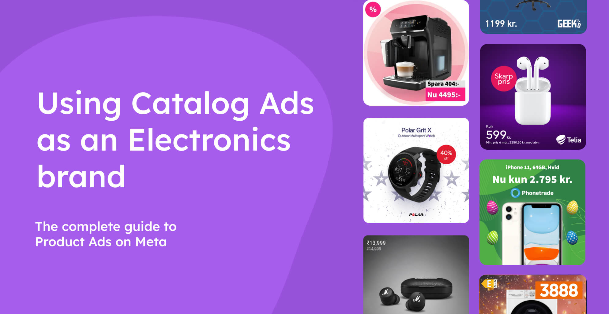
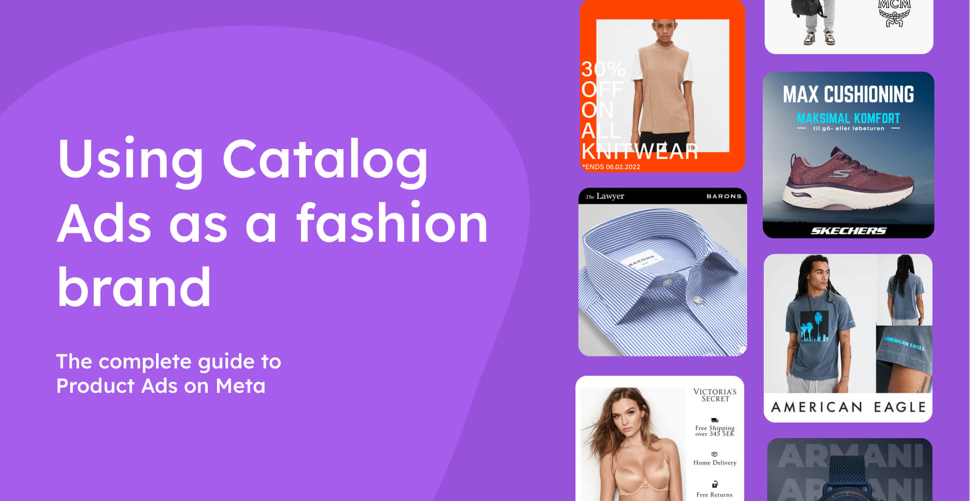
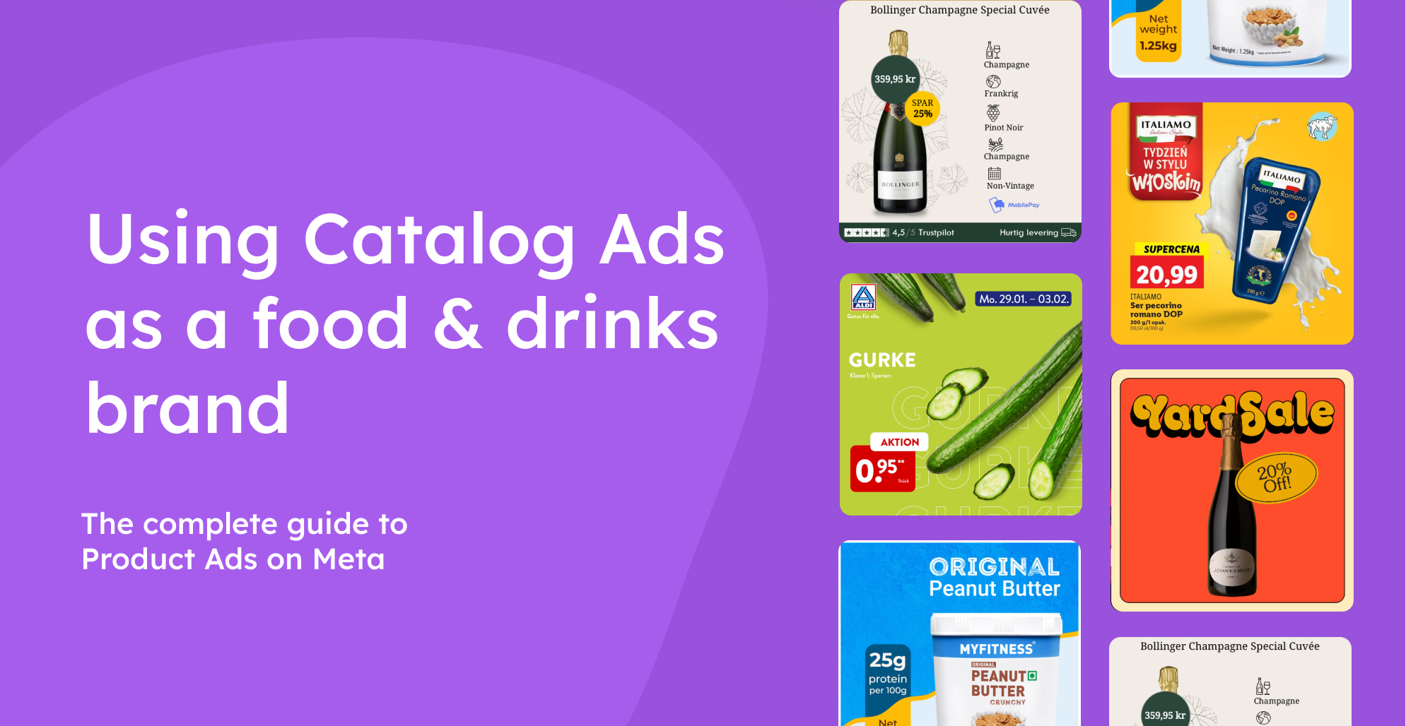
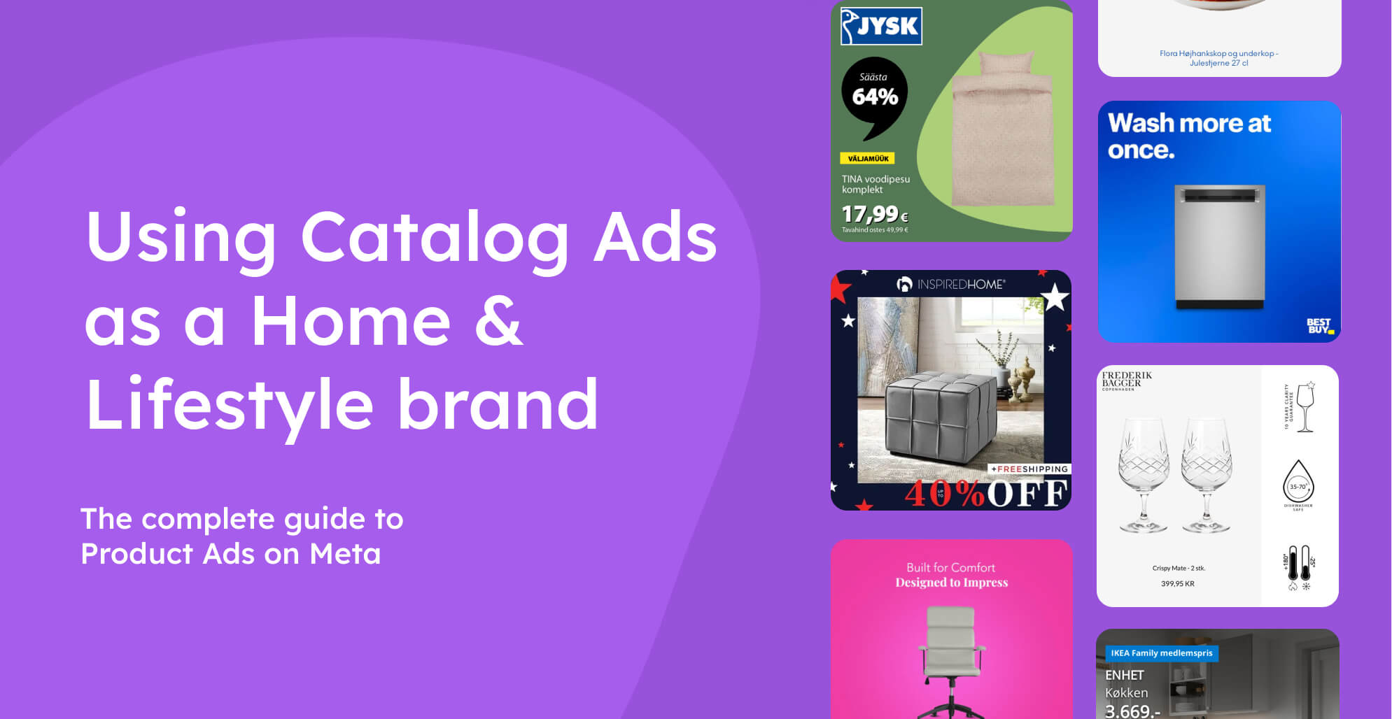
%20(1).png)
%20(1).png)
%20(1).png)
%20(1).png)
.png)
%20(1).png)
%20(1).png)
.png)
.png)
%20(1).png)
.png)
.png)
