Get started with Inspiration Analytics
Start analysing your advertising and get inspiration for what to improveTable of Contents
Before starting:Selecting the insightUsing the filters and choosing a metricUnderstanding the graphsThe Inspiration Analytics feature can help you understand what works in your ads and what doesn’t so you can apply it and optimize your designs to reach much higher results.
A key thing to know is that ads often require different tactics. That’s why we have many Insights for you to choose from, including different audiences, campaign objectives, and key periods.
All of our Insights have a certain theme and are focused on answering a specific question with graphs, examples, and breakdowns. Of course, you can change the filtering to analyze different metrics such as click-through or cost per purchase.
Before starting:
- Make sure to connect your Business account in Integrations
To use Analytics “viewer/ partial access” in Facebook is sufficient, however, we recommend that a user with “full access” connects this if you’re also planning on using our Feed Automation feature
- Please give our system up to 24 hours to retrieve, process, and analyze all data with AI. Depending on the size of the dataset, this may be faster for you.
Selecting the insight
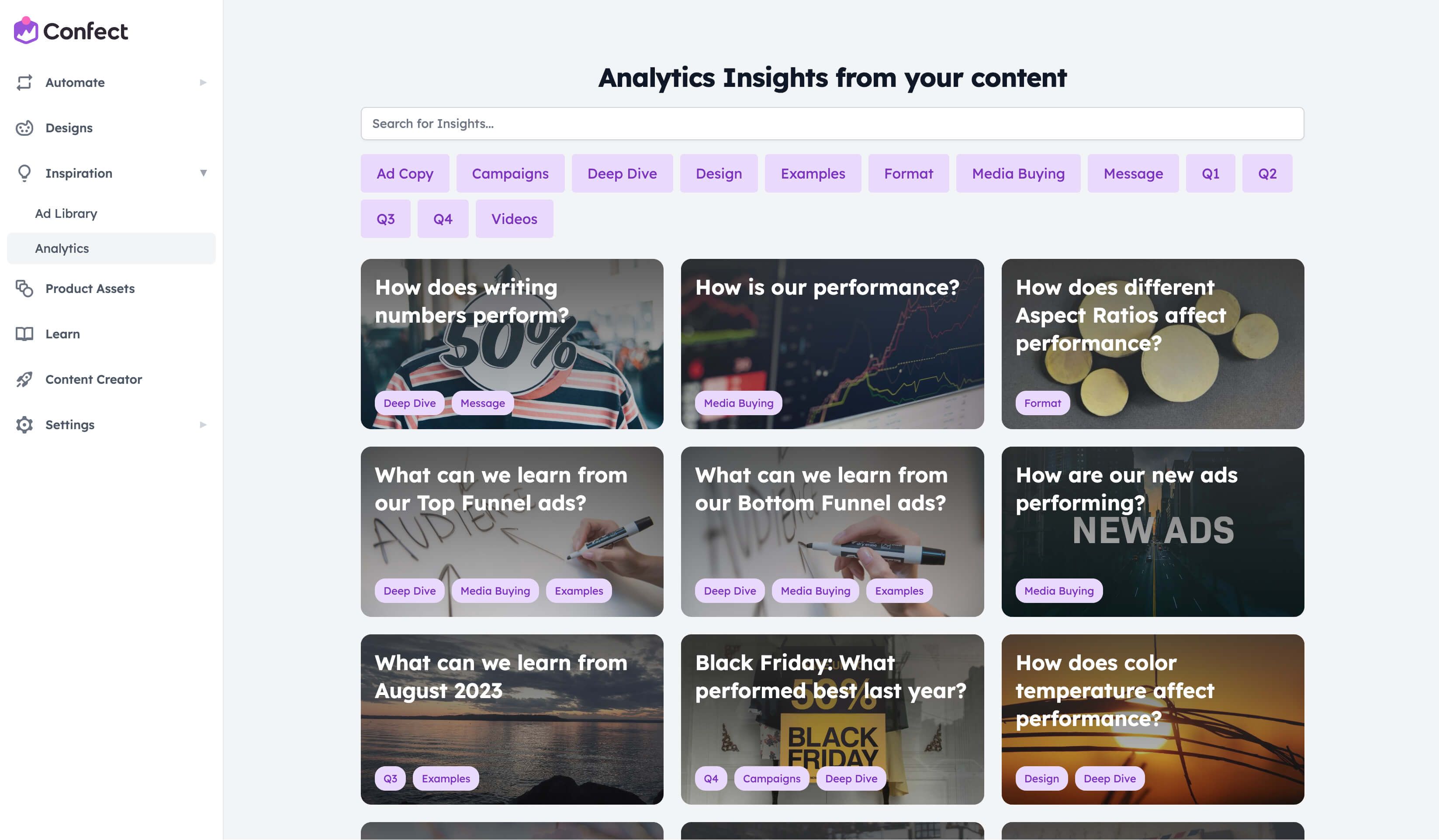
As the first step, go to the "Inspiration" tab, and then "Analytics". Here, you can either browse through the available insights or look for a specific one using the search bar.
You can also click on the buttons right below the search bar to narrow down the visible Insights.
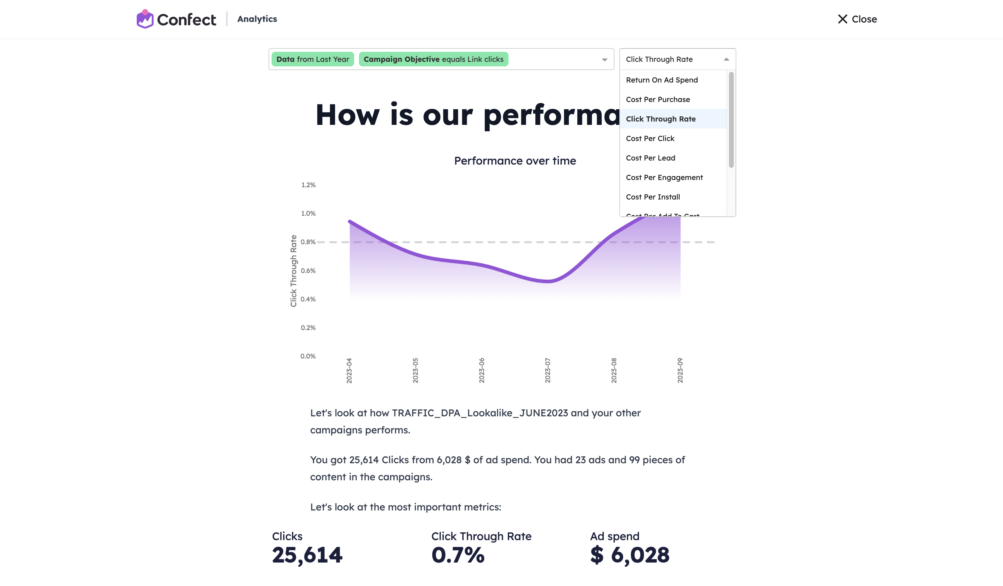
Using the filters and choosing a metric
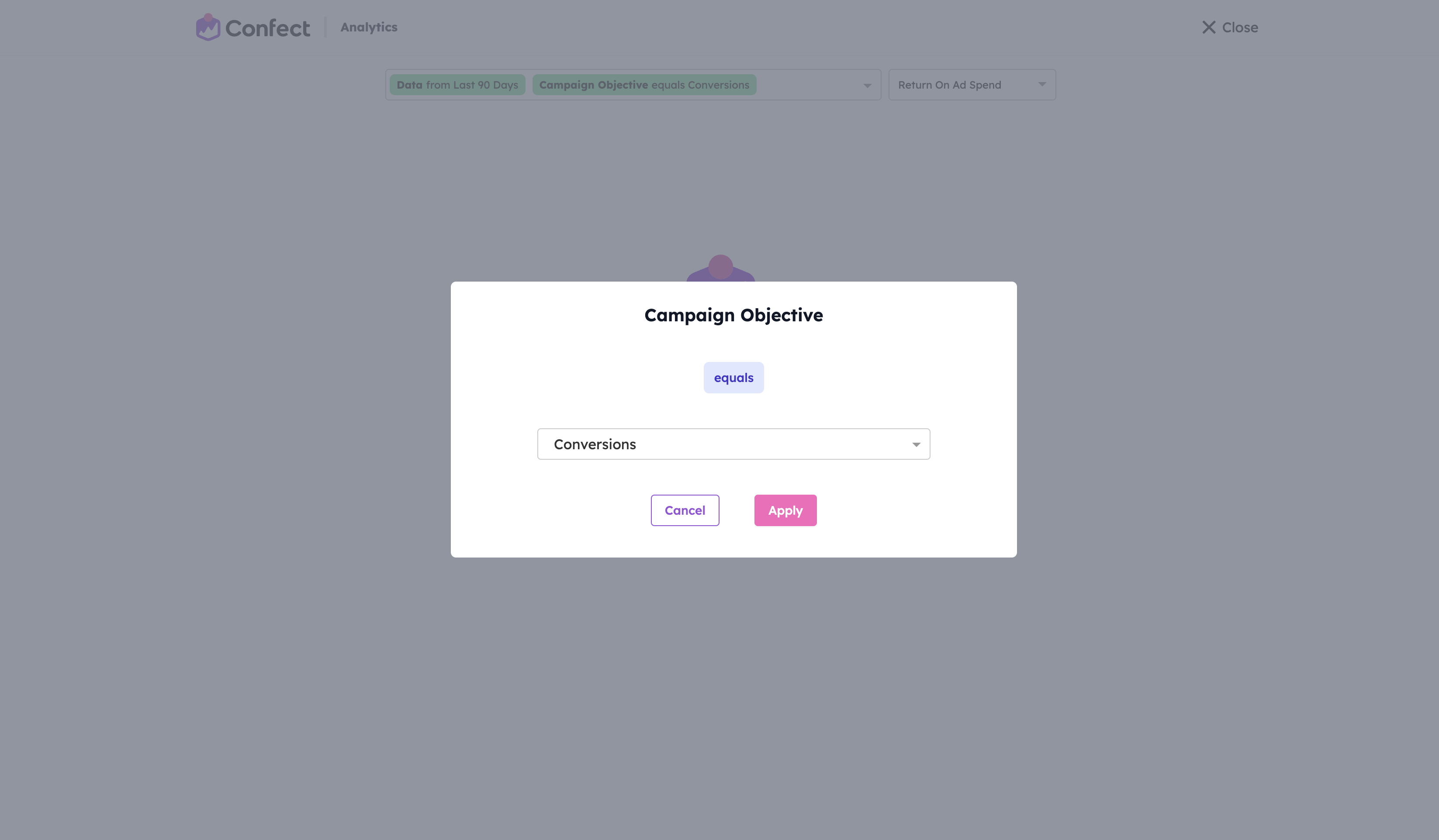
Once you open an Insight you’re interested in, it will, by default, display conversion-focused campaigns and ROAS as the key metric.
If you want to look at other campaigns, click the “Campaign Objective equals Conversions” option and change this to an objective of your choice.
In most Insights, you can also change the data period, or click the dropdown to apply additional filters such as Adset name or Media type.
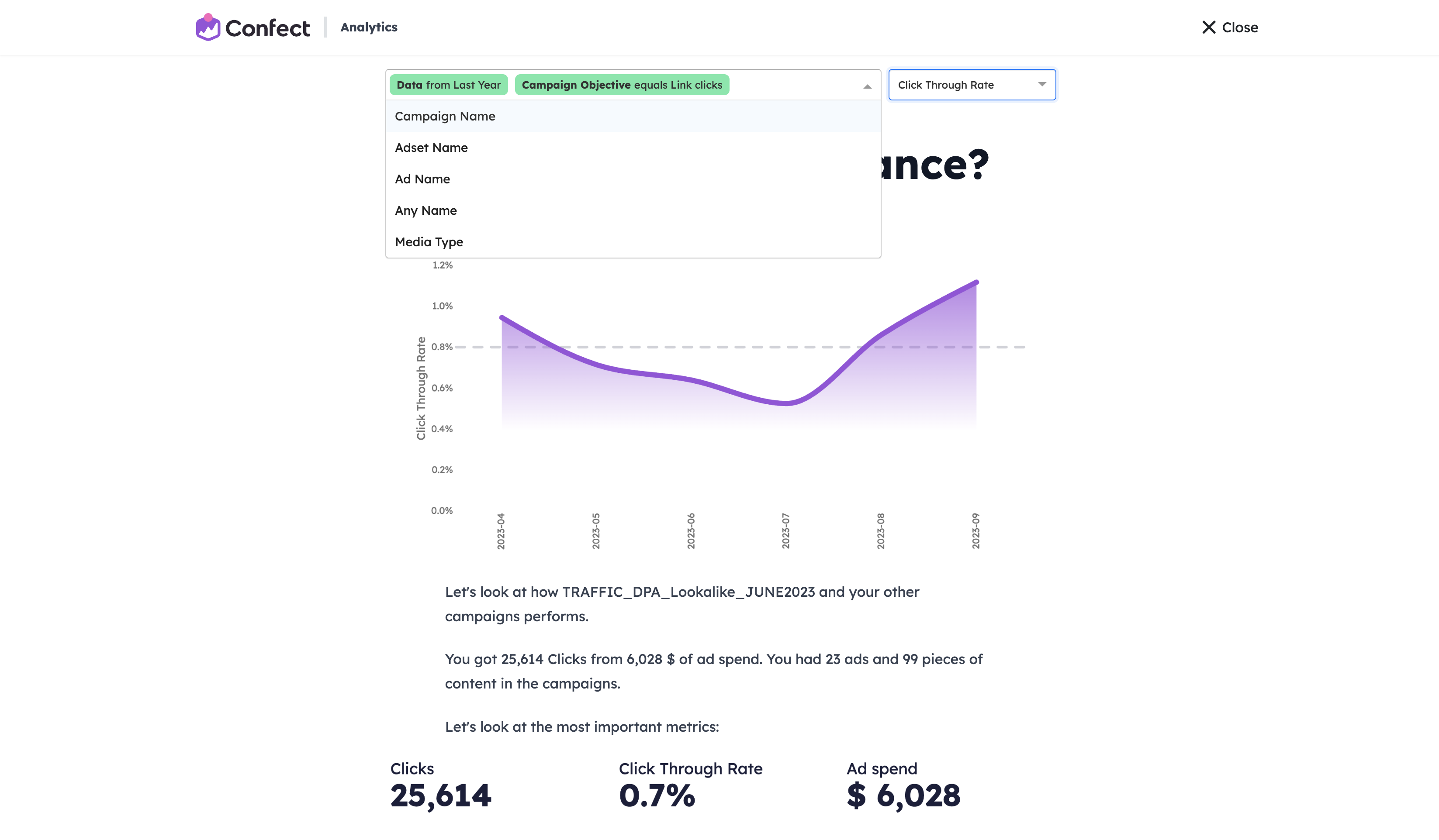
To change the metric displayed in graphs, click the dropdown on the right side and select the desired one.
Understanding the graphs
Each graph on an Insight page has a headline. This focuses on a specific aspect of your ad, ranging from design (i.e. text amount, colors, etc.) or broader information (i.e. content category, or metrics such as CPM or Performance).
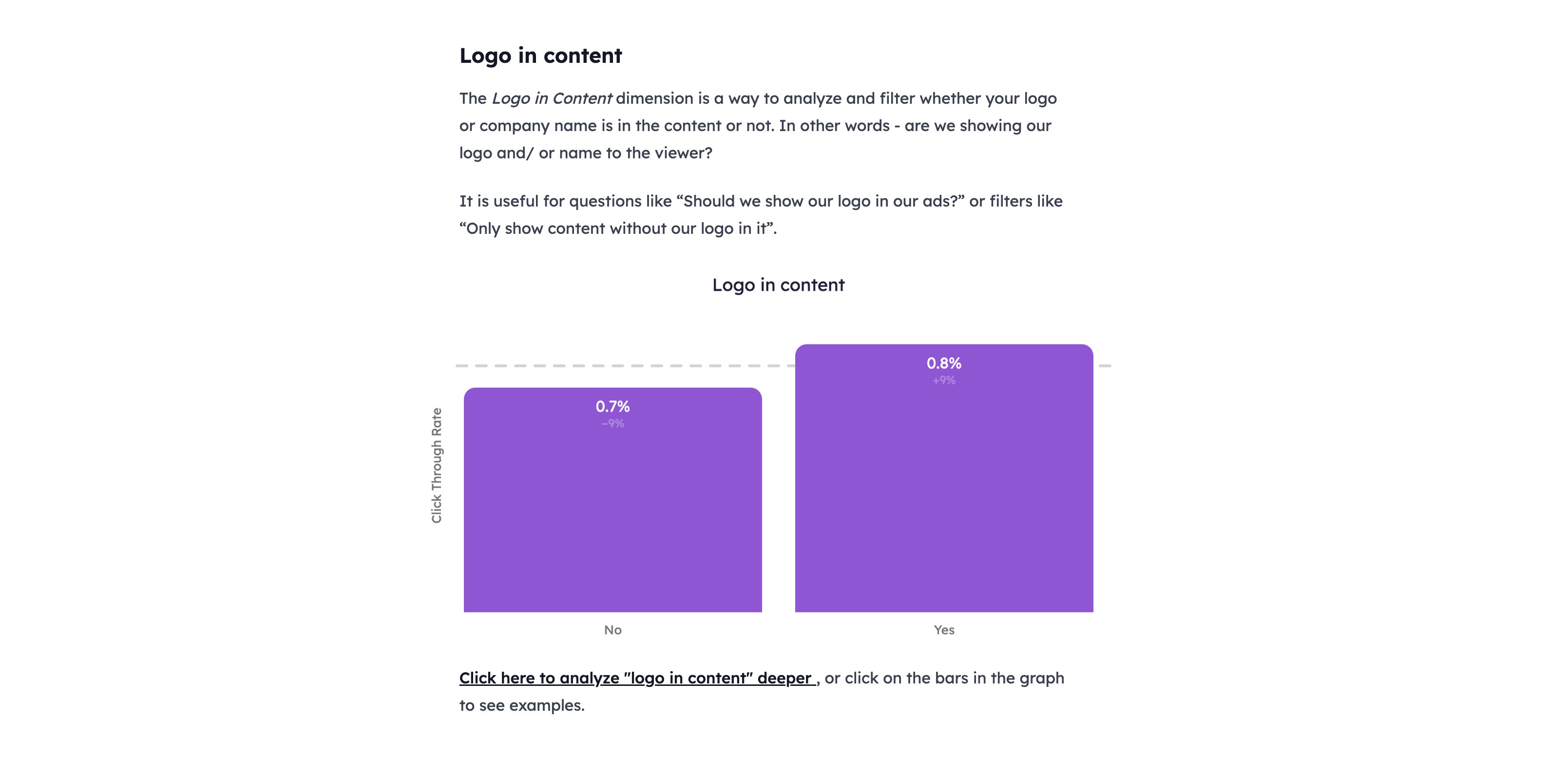
Bar charts can help you understand the impact of different choices on your key metric, such as whether the ad has a logo in the content.
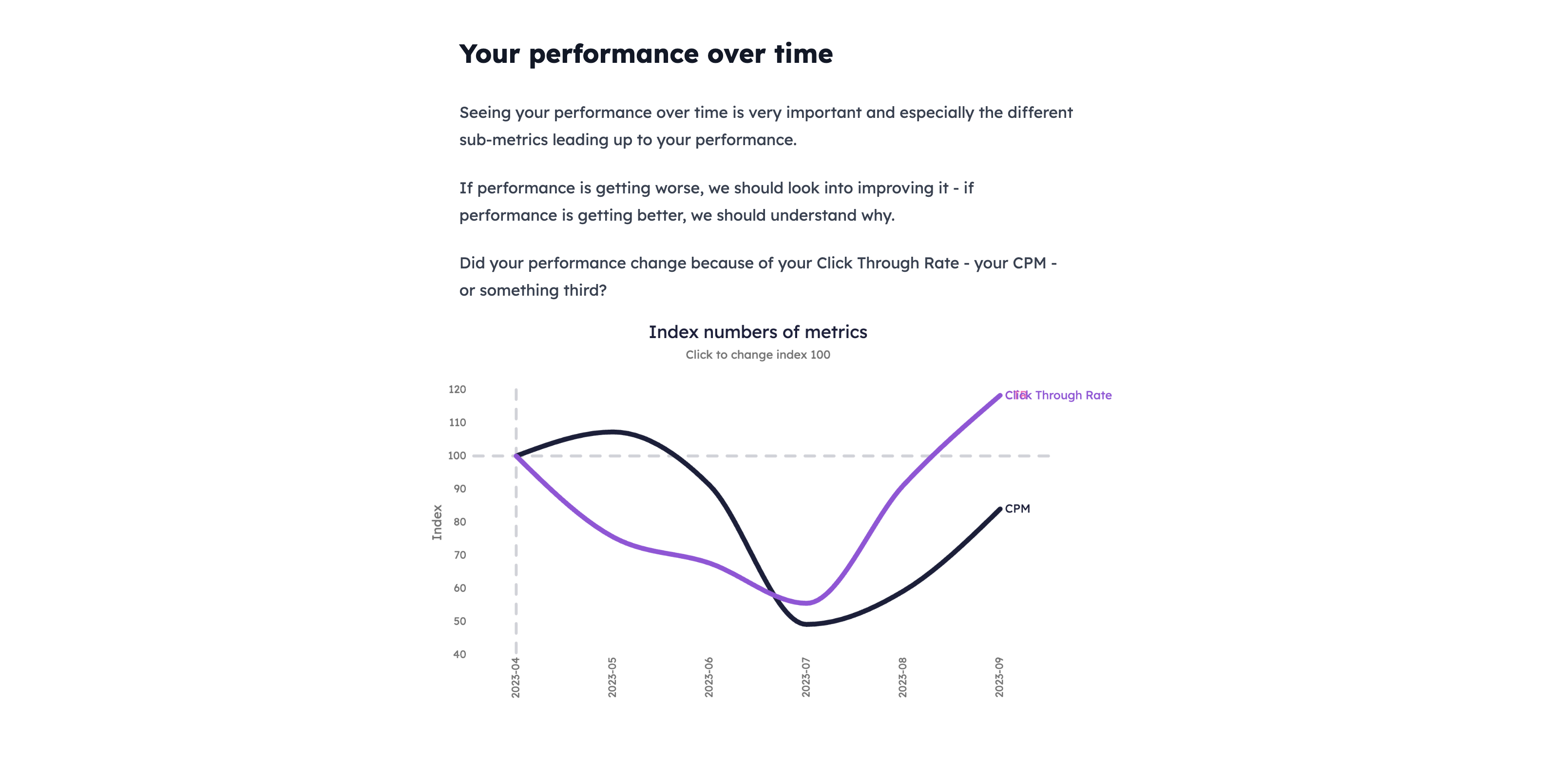
Line charts can be used to understand how your key metric changes over time, for example, to judge whether your ads are outdated and struggling from ad fatigue.
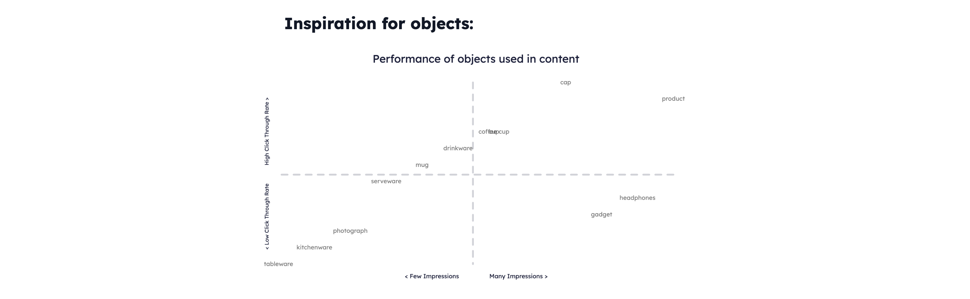
And lastly, matrix charts can be used to find correlations between certain words or objects used in your content, and the performance of your ads.
The vertical axis shows your key metrics, while the horizontal axis shows whether the word or object has received many, or few impressions. The more impressions (the more to the right) the more reliable the correlation is.