Add shadows to elements
Add a shadow for more depth and lift elements off the backgroundTable of Contents
Add shadows to elementsShadow settingsTypeSizeOffsetBlur radiusColorOpacityShadows is a quick and easy way to add different kinds of shadows to your design elements.
This can, in some cases, make the design seem more 'real', or make the product stand out a bit more from the background.
Add shadows to elements
You can find the "Shadow" options in the lower right when a layer is selected.
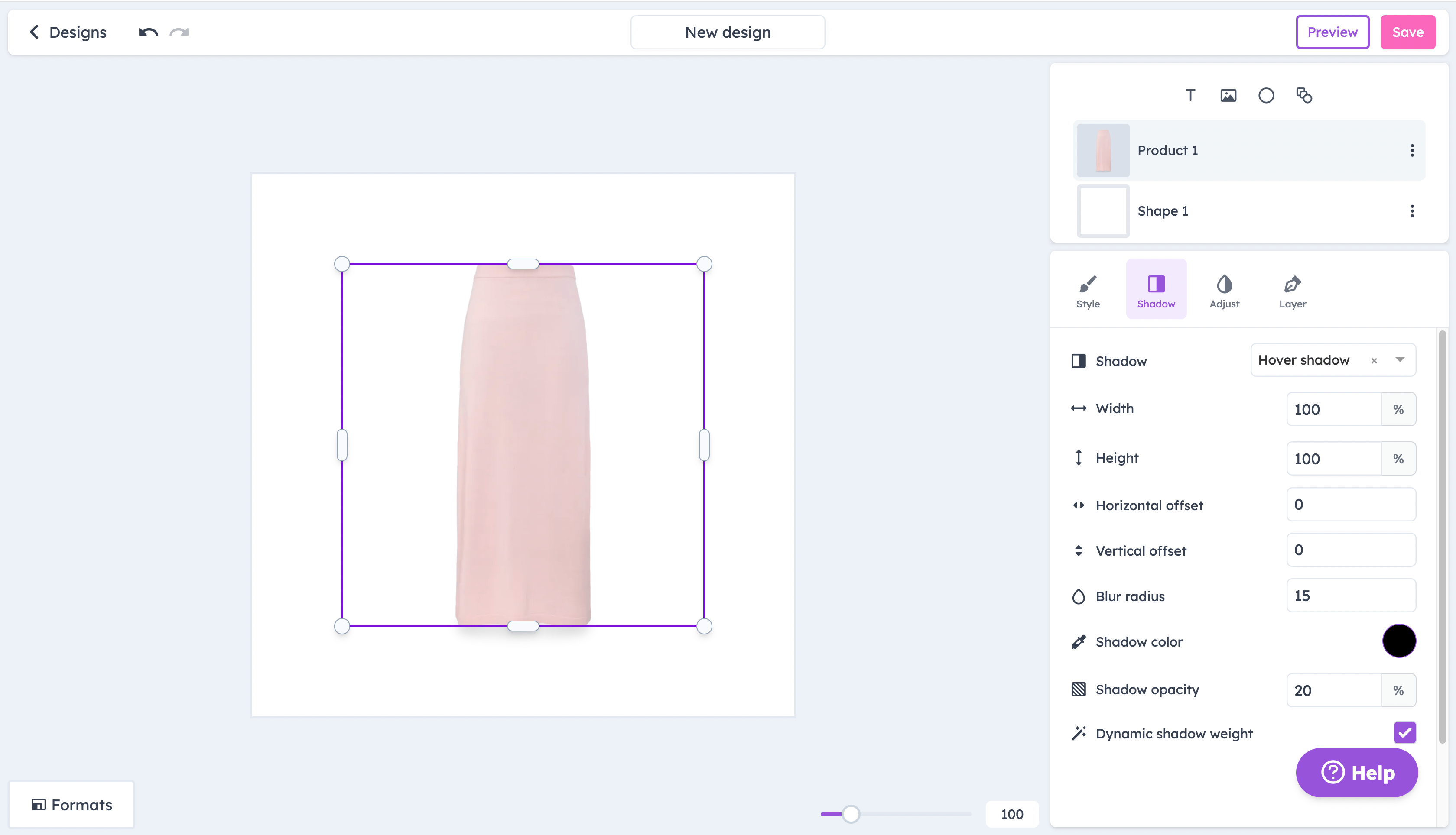
Shadow settings
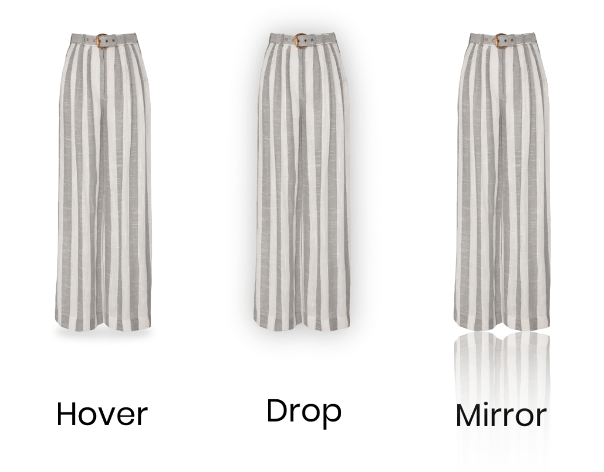
Type
- Hover shadow: Puts a shadow under the element, like a lamp was shining over it.
- Drop shadow: Puts a shadow 'behind' the element, like a lamp was shining on it from the direction you are looking.
- Mirror shadow: Mirrors the product downwards, so the shadow is essentially a mirror of the element.
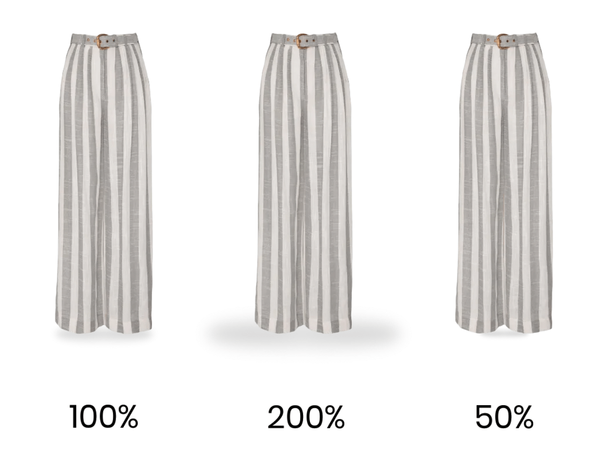
Size
Changing this option adjusts the scale of the shadow. This being set to 100% means that the shadow will be the same size as the element it’s added to.
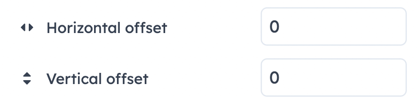
Offset
This setting will offset the shadow to the left/right, or up/down.
For example, setting the vertical offset to 10 will move the shadow slightly lower, while -10 will move it slightly up.
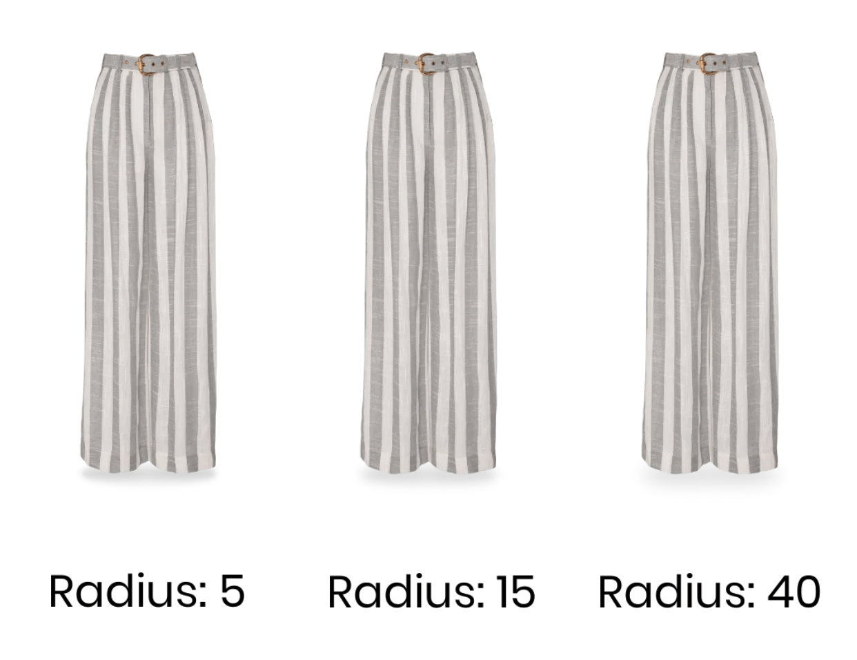
Blur radius
This adjusts the gradient from the color of the shadow.
A blur radius of 0px will create a solid color shadow with no blurring, while a 50px radius will make the shadow fade out in a 50px radius.
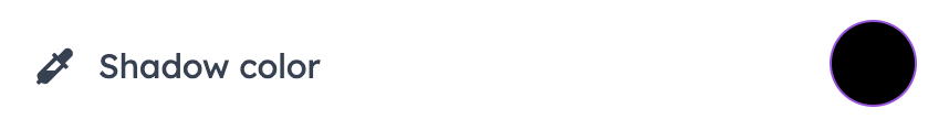
Color
This is the color of the shadow. It is set to black by default, but can be changed to better fit your design
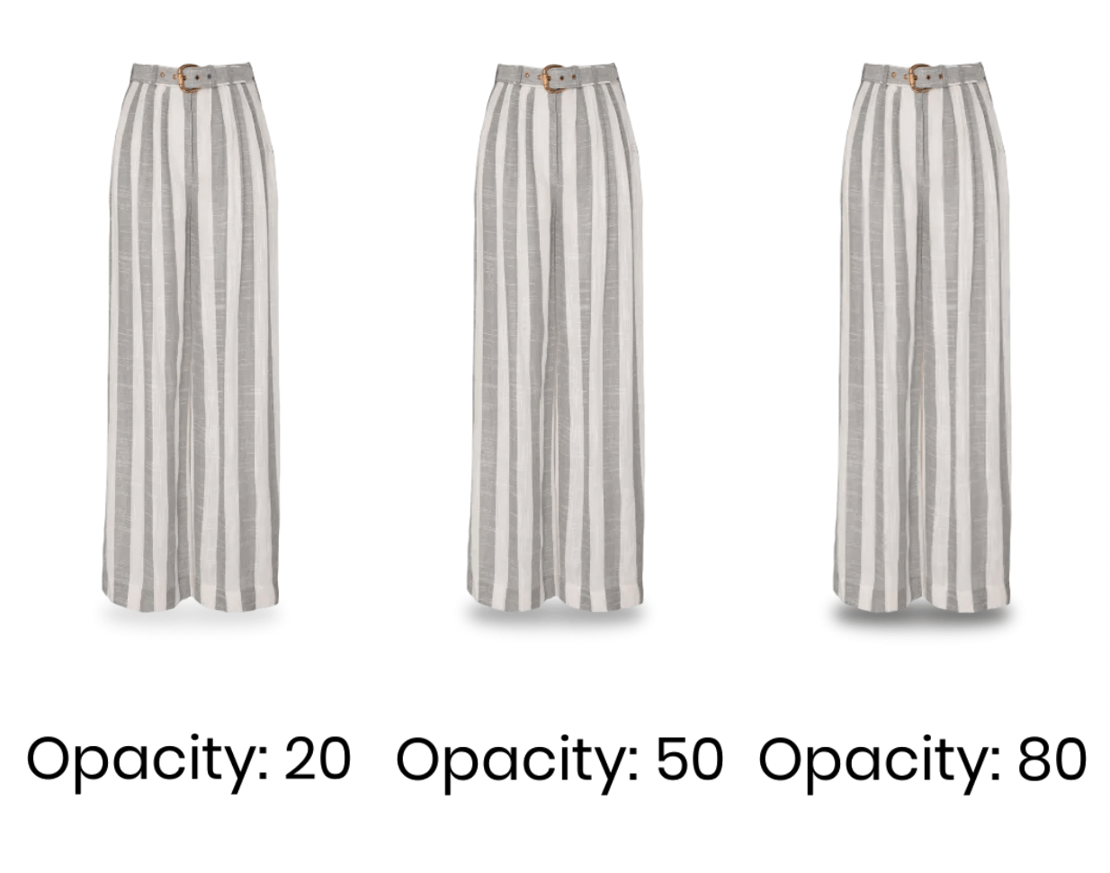
Opacity
This setting changes the opacity, or intensity, of the shadow.
A 0% opacity means the shadow is completely see-through and invisible, while 100% means that the shadow is not see-through at all.